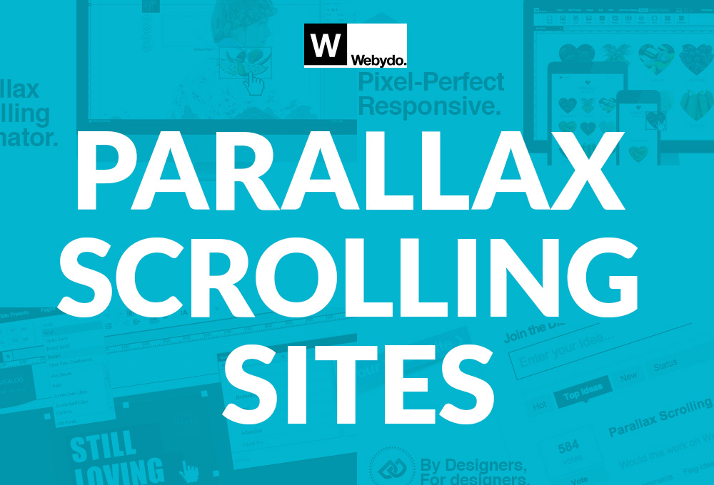
Parallax scrolling is cool. There's no argument about that. The unique experience created with such simple scrolling animations can be a powerful tool for engaging your audience. In fact, some of today's most successful websites employ parallax scrolling to varying degrees. If it can bring such great success to others, how could you go wrong with such a fun design method?
Unfortunately, the smooth effects of parallax scrolling mask some hidden pitfalls which, if not carefully navigated, can lead to disappointing results in even the most successful sites. In an effort to save you from these potential headaches, we've gathered a few of the most prevalent issues you should keep in mind when employing this trendy feature. You should also read this article by Webydo’s product manager Nir Barlev: 7 Parallax Scrolling Tips That Will Change The Way You Design Websites.
Humans Aren't the Only Ones Looking at Your Designs
You know what? For as slick as a well-designed parallax scrolling feature appears to us sentient beings, there's an awful lot that's lost on modern search engines. Google's web crawlers just don't appreciate the visual creativity parallax can offer. Not only that, but these search engines are built with a natural bias against the single page designs they typically embody!
The real cause of hostility between parallax heavy websites and the search engines they strive to appease boils down to metadata. What is metadata? It's the bite sized information that describes the sites you build. Unfortunately for proponents of the trending single-page design popular with parallax users, this meta data was created to describe a single page at a time.
With traditional, multi-page designs, each page contains very specific content that can be easily described in the metadata. Search engines love this. They know exactly what each section of your web site contains and therefore rank your site more accurately. The issue with single-page parallax designs is that they have to cram a whole site's worth of meta data into one header. Did we mention there's a size limit to the meta data too?
All of this creates a less than ideal environment for search engine crawlers. If the crawler has difficulty gathering good metadata, your page ranking can take a hit.
A Great Design is an Accessible Design
In addition to search engine optimization woes, sites designed around parallax scrolling often take hits in the usability department. As a general rule, people browse the web to consume content. If a particular site makes consuming said content difficult, it's likely not going to be terribly successful.
In this sense, parallax scrolling's greatest strength can often times be it's greatest weakness. As users scroll through a parallax design, their attention can be easily guided as their eyes naturally follow movement on the page. While this method can be incredibly intuitive for the user, when overdone, it can quickly cross the line into sensory overload. Too much animation will distract from content rather than attract the user to it.
Yet another hit to accessibility when using parallax scrolling is the static nature of its content. Due to its strict dependence on positioning, content must conform to rigid parameters when used in parallax animations. This makes it very difficult to ensure dynamic content won't break the design.
Being Mobile Matters
At this point, we all know how important mobile browsing is to the web design industry. Users are consuming more online content than ever thanks to the increased connectivity offered by our mobile devices. As they transition from desktop browsing to mobile browsing throughout the day, they expect consistent experiences regardless of which device they're currently using.
Creating designs that provide such seamless transitions is difficult enough. Adding elements like parallax scrolling that rely so heavily on screen size and position only compounds the problem. Animations like parallax scrolling aren't lightweights either when it comes to load times. Despite the many benefits mobile browsing has introduced, increase patience isn't one of them. It's always important to weigh the benefits of high-maintenance features against any accessibility and mobility hits you might incur.
So what have you learned after reading through all these cautionary tales? Never use parallax scrolling right? Not at all! Parallax scrolling, when used effectively and for the right purpose, can be an incredibly powerful method of design. The entire point of this writing is to simply bring to light the very real "dark side" of this trendy web element. By keeping these potential pitfalls in mind, you'll be better equipped to use parallax scrolling to create designs that are both captivating and useful!
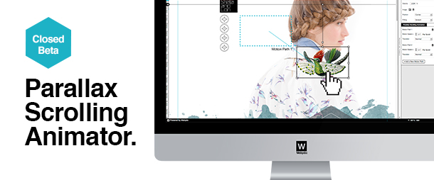
To put theory into practice sign up to Webydo and create a website with parallax animation.
Author bio: Tomer is an award-winning designer and a UX Manager at Webydo – the code-free website design platform for professional designers – where he manages the UX development team to push beyond the limits of creativity.