Once you’ve had one or more multi-page website designs under your belt, putting a one-pager in place should be a piece of cake – right?
It doesn’t work that way. When you’re trying to get everything you feel is important on a single page and do it in a way that won’t send visitors scurrying toward the exits, you’ll either discover building a one-pager isn’t so easy after all, or you’ll go and publish only to wonder later on why you’re getting so few conversions.
Designing a one-pager takes a significant amount of planning, which is the purpose behind the following guide that addresses 5 critical elements that can make or break a design.
Take them to heart and you’ll find yourself on solid ground.
5 Critical Elements that Can Make or Break Your Design
#1 Identify the GOAL and Work Toward It
It simply doesn’t make sense to start designing a one-page website if you haven’t nailed down what you expect it to achieve. Set a goal first, and then start planning a design structure that will achieve that goal.
A typical one-page website is designed with a single goal in mind with:
- the purpose of selling something.
- the purpose of announcing an event.
- the purpose of presenting a portfolio, etc.
Now that you have a goal in mind, you can start concentrating on how to go about achieving it and not do dumb design things that might chase visitors away.
Like slow load speed for example.
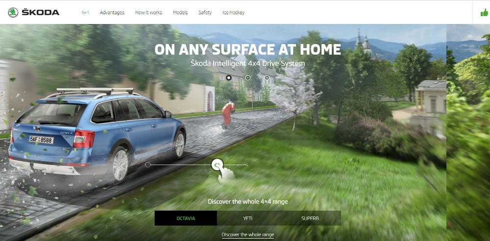
To avoid creating a page that takes forever to load, where “forever” may be anything more than 5 or 10 seconds to some, be careful with special effects like parallax, that can slow things down.
Bistro Agency
This website features a nice interactive effect that’s above the fold and doesn’t drag down its load speed.
Be Moving 3
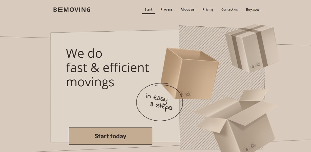
This BeTheme pre-built one-pager avoids slow load speed by tricking you. Its features include a static image that appears to be dynamic.
Think Pixel Lab
Tiny animated items have been added to liven up this page’s illustration, but they do not slow anything down.
Be Product 2
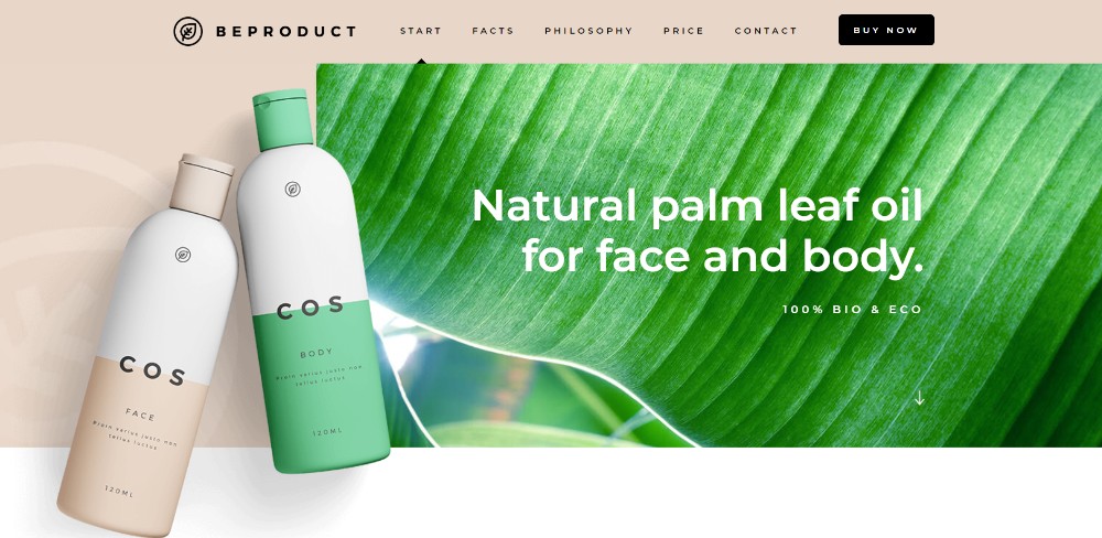
Sometimes a page’s fresh look is all you need to make a selling point.
Sheerlink

This page is an excellent example of how engaging and effective large images and sliding panels can be.
Be App 4
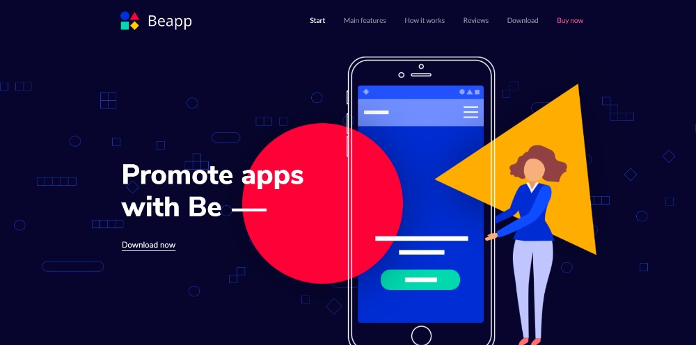
A long, drawn-out technical dissertation isn’t necessary to successfully promote an app. A genuinely cool presentation like this one does the trick.
#2 TEXT: Keep Text to the Minimum & Make Sure It’s Easy to Read
Avoid clunky blocks of text by all means. Users aren’t looking to read a novel. Keep text to a bare minimum by going with bold headlines, concise paragraphs, and bullet lists. Make an extra effort to integrate text with images in a meaningful way.
Dangerous Robot
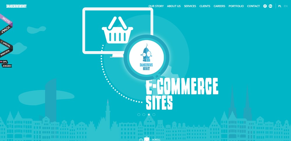
This website is so entertaining that you might want to go through every section a second time.
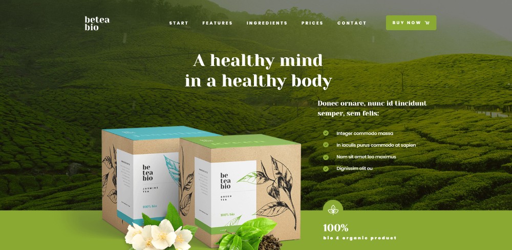
Be Tea 3
Hello Alfred
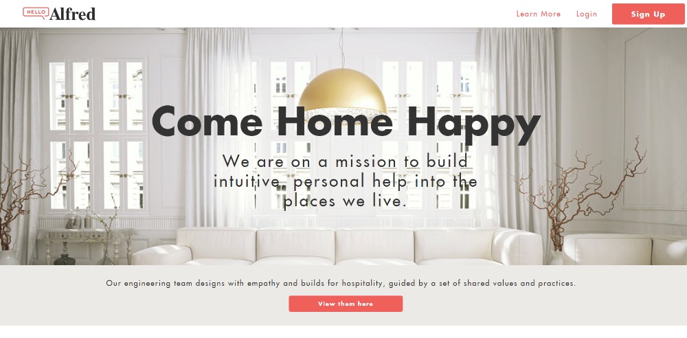
The key information is above the fold, and bullet lists save space by keeping the message concise.
Be Cakes
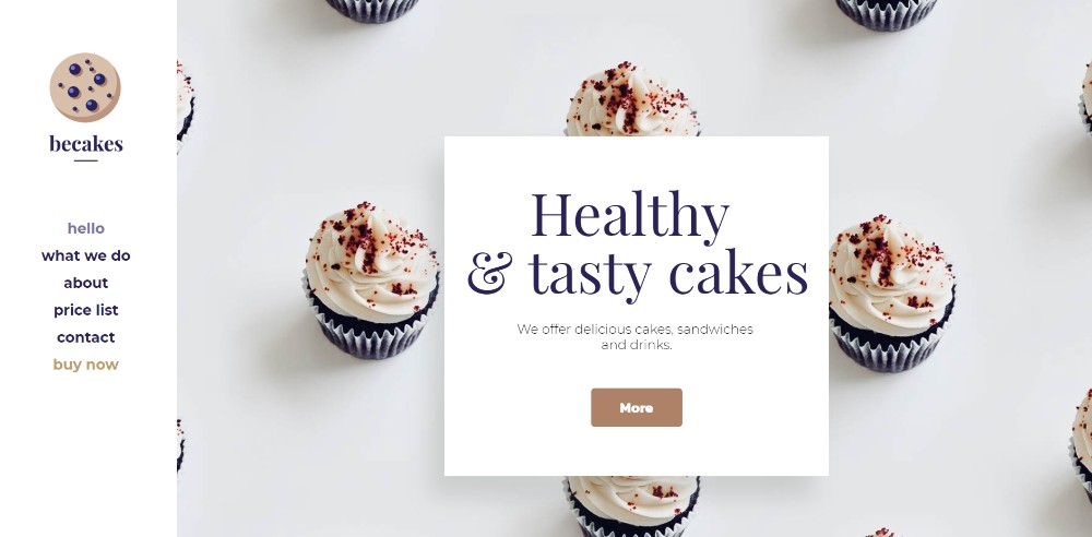
Another example of why large attractive images accompanied by appropriately placed paragraphs of text can be so effective.
Mercedes-Benz
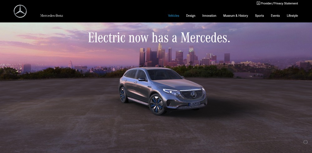
When you’re advertising a vehicle that has the stature of a Mercedes you can focus more on
#3 VISUALS: Identify the Right Patterns & Use Negative Space Wisely
It’s well known that people tend to scan an image in a Z pattern and follow
You always want to be attracting attention to the critical stuff and avoiding things of secondary importance.
Chris Connolly
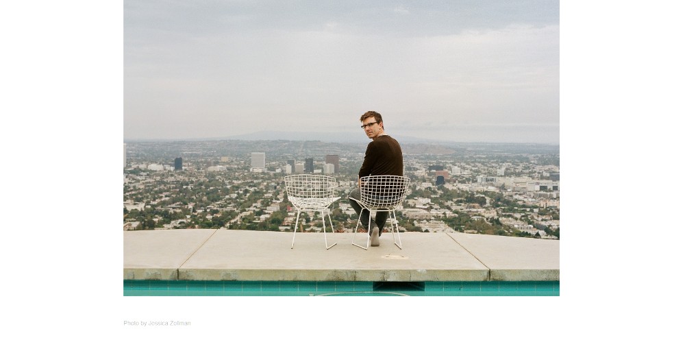
This website provides an excellent example of how the proper use of white space gives a sense of order.
WeShootBottles.com
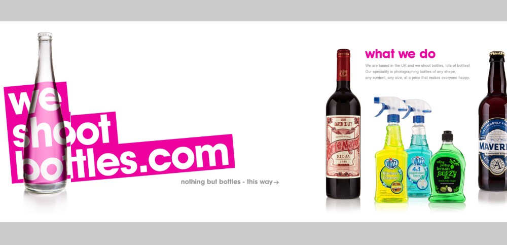
This website uses white space – as a canvas for wildly creative content.
Be Dietician 2
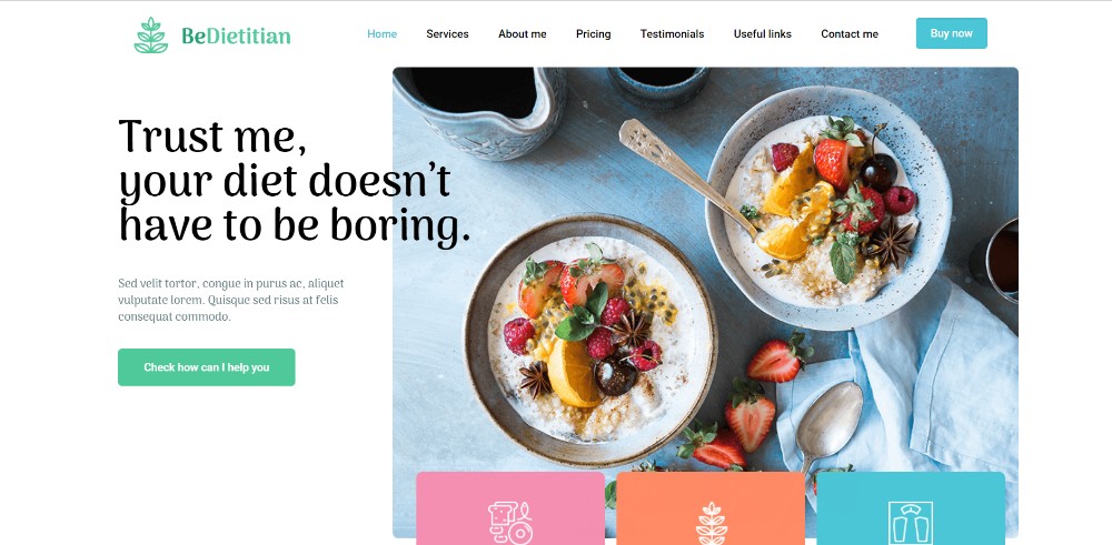
This pre-built one-page website shows how white space can be used to maintain a sense of order and make the various sections appear to pop out.
Dribble’s Year in Review
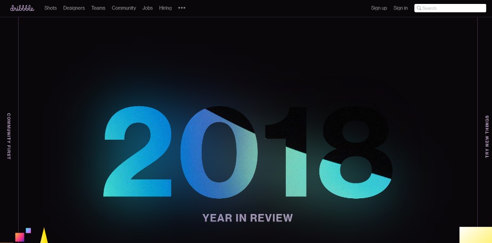
Here’s how you can use a mix of different design principles to create an amazing visual splash. Not easy, but definitely possible.
Nasal Drops
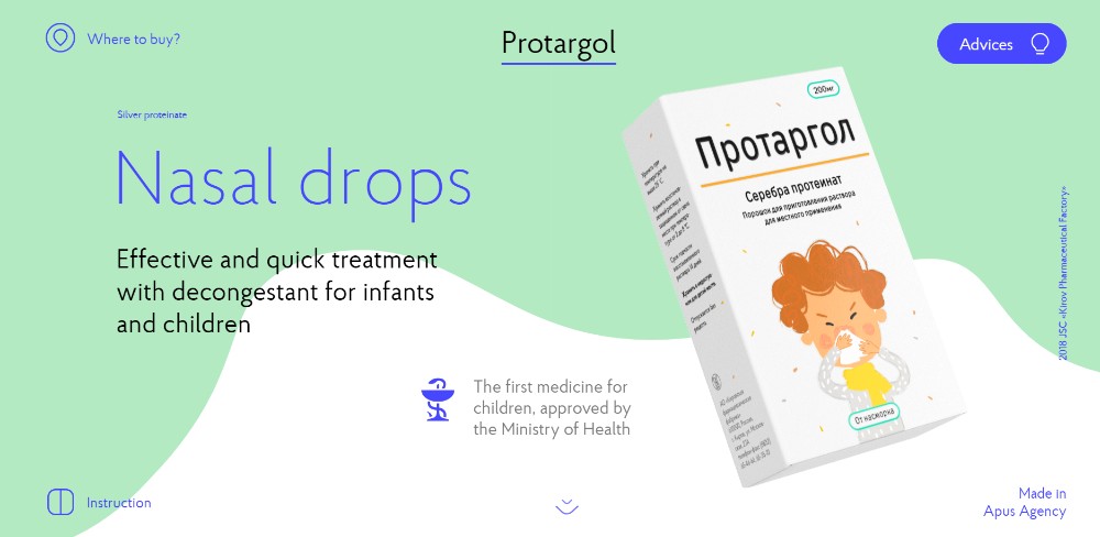
Have you been commissioned to produce a page promoting nasal drops that will excite? Fear not. This one breaks the mold with its ingenious use of slides, animations, and white space.
#4 NAVIGATION: Making It Easy to Navigate and Entertaining to Scroll
You have to be careful when choosing navigation functionality for a
Alternative navigation is
Sergio Pedercini
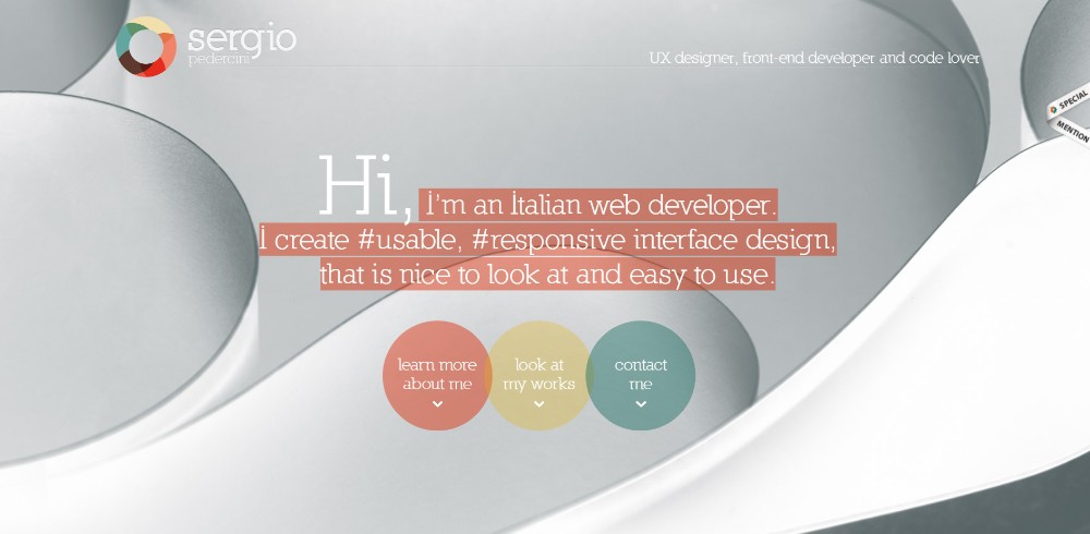
This website puts 3 different auto-scrolling links to good use.
Be Game
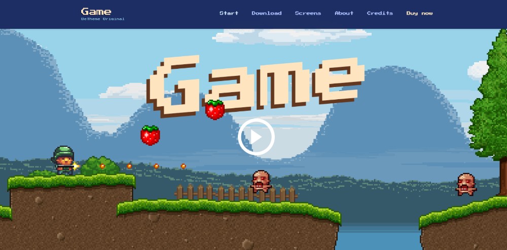
You might find Be Game’s navigation experience highly entertaining.
Be Landing 2
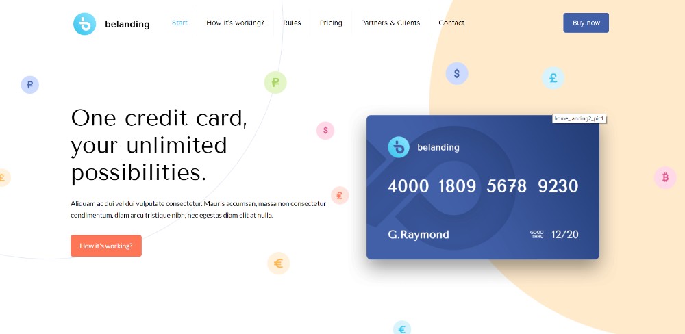
Be Landing 2 illustrates how you can scan a page with 3 mouse scrolls.
Brainflop
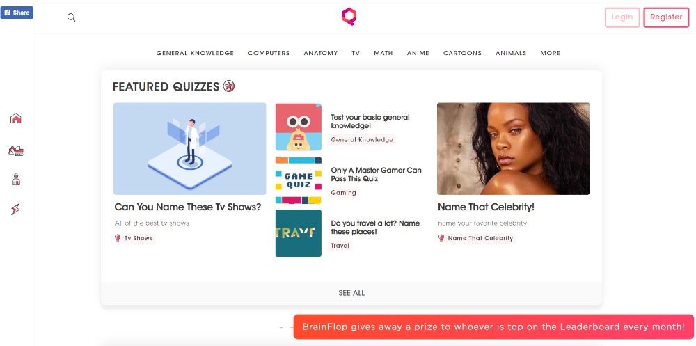
A menu on the top and one on the left is one way to help visitors navigate a site.
#5 CALL TO ACTION: Identify the Type or Style of CTA You Want and Don’t Hesitate to Use It
Critical element #1 addressed the need for a goal. #5 addresses the final step toward achieving that goal. Don’t hesitate to use CTA buttons, place them above the fold, and make sure they stand out.
It’s not all that difficult since the aim of most one pager sites is to direct people toward a single action. For multiple products you may need more than a single CTA button, and you may want to use Learn More buttons in addition to the usual Buy Now buttons.
Be Hairdresser
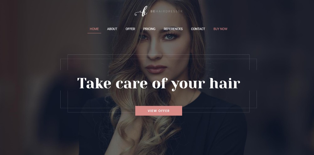
In Be Hairdresser the CTA button is placed above the fold. There is also one
The Art of Texture
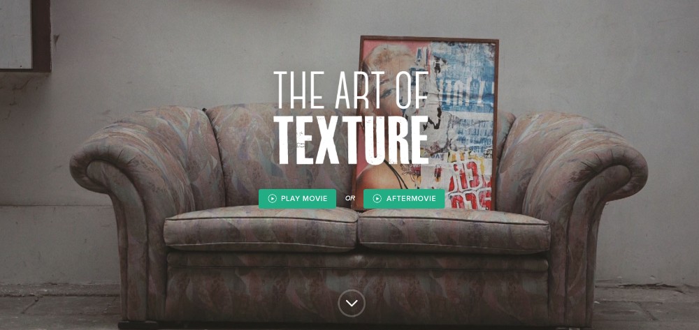
Two CTA buttons placed above the fold give users a choice.
Pyrismic

This site uses a simple opt-in form with a CTA button that stands out.
Reneza
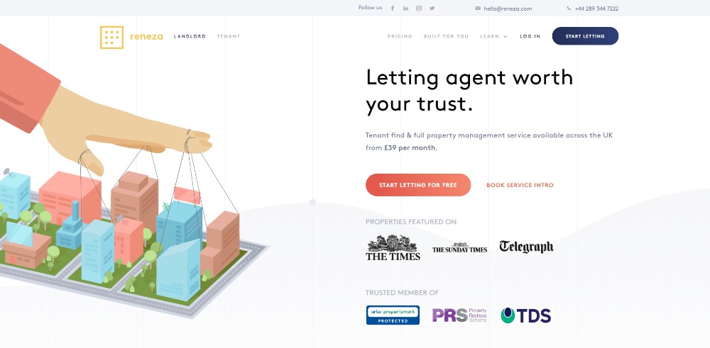
Reneza uses CTA buttons freely but judiciously and with a proper choice of colors and text sizes.
Wrapping It Up
It’s one thing to know and be able to recite these 5 critical elements of one-page website design. It’s quite another thing to practice them and apply them religiously.
They may seem straightforward, and they are, but when you start mixing them it can be tough; in which case you might find this shortcut appealing:
Use prebuild websites that have already incorporated these critical elements.
Be Theme is a good resource with its huge library of 400+ pre-built websites including more than 60 one-pagers; each of which can be customized to fit your needs.