
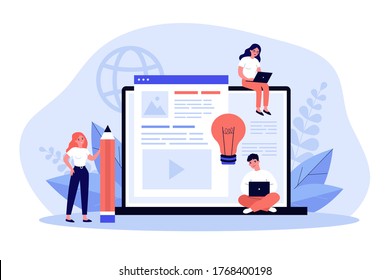
One-page website design is the first choice of many people because of how easy it is to build. Multi-page websites take a lot of time to build. This is not to mention that they are usually slower than one-page ones. There is a downside of one-page websites. It is hard to make them user-friendly and aesthetically pleasing at the same time.
A single-page website should normally be easy to design. It should also take less to design when comparing it to a multi-page website. This is often not the case because of the many details that developers have to keep in mind.
Luckily, there are some aspects that can influence the one-page website design process. This article is a guide for people who are planning the best one-page website design layout.
A list of five important factors to consider in one-page website design is included below. As well as a description of each and several good examples to inspire designers. Here’s what you should pay attention to:
1. The goal of the website
Each website has a goal, and there is no point in starting one if you don’t know what it is going to be about. Based on the objectives you set for the website, you can determine where the design is headed. One-page websites usually have one single goal. It should be easy to achieve through the functionalities of such a layout. The most common goals are:
- Selling a product or a service
- Presenting a portfolio in a professional manner
- Announcing an event etc.
Here are several examples of one-page websites that have a clear goal. They don’t complicate their design with elements that may cause unwanted downsides:
Bistro Agency
The website does contain interactive effects that make it engaging and interesting to use, but they don’t influence the website’s load speed in any way.
Be Moving 3
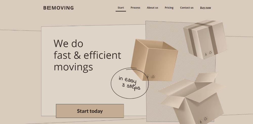
This is a BeTheme pre-built template for one-page websites that only involves a static image and several CTAs. It is a very dynamic website that gets the job done as long as the purpose of the site is well-defined.
Think Pixel Lab
This one-pager relies on animated items. The page contains illustrations to present the main idea of the site, but it is optimized so that users won’t encounter any difficulties when navigating.
Be Product 2
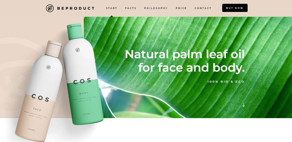
This is an example of how product-selling websites should look like ideally.
Sheerlink
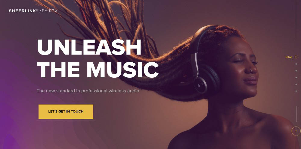
This is a one-page website that makes great use of images. The sliding effect, as well as the warm-tone images, create an aesthetic finish that makes users stay.
Be App 4
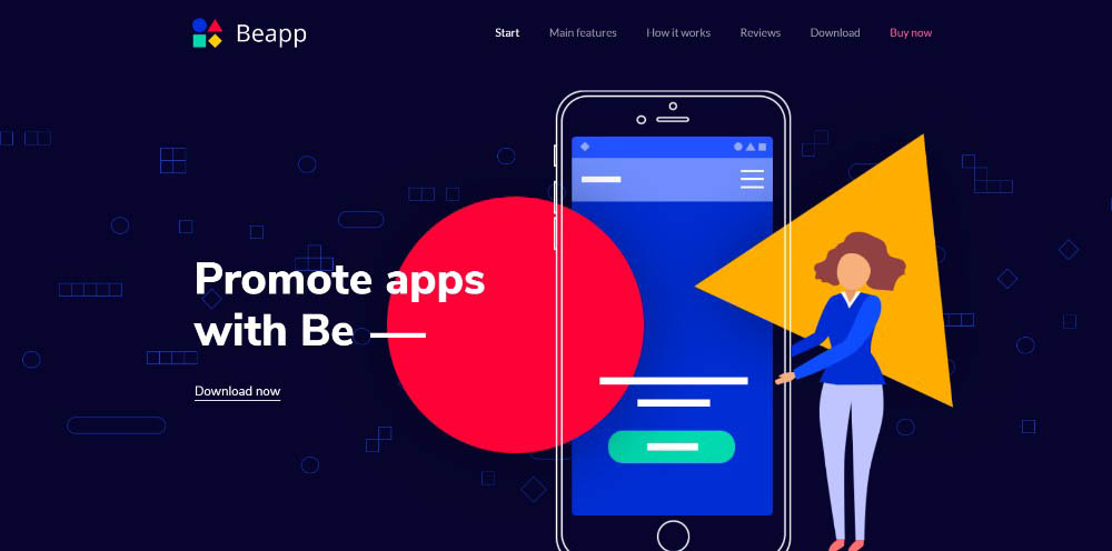
For users who want to present their app is a way that is convenient for the users, this example should be taken into account. The colors are vivid, the illustrations are simple and the overall presentation makes users interested in what the app has to offer.
2. The content and how it is served to the user
Filling websites with content can be tricky if certain rules are not respected. One-page website design needs to be focused on how content is delivered. Large amounts of text are not recommended for such layouts. So developers must find ways to incorporate short messages on the site.
Blocks of text bore users and they often leave the website within seconds because of it. To avoid such a result, you should separate the content in smaller bits. Combine it with entertaining visuals. Content has to be easy to comprehend and to encourage a quick understanding of the message.
Keep an eye on websites such as:
Dangerous Robot
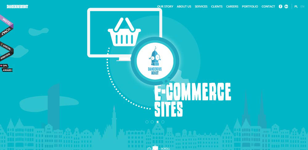
This website is so beautifully built that it would make you spend time on it even though you might not be interested in what they have to say.
Be Tea 3
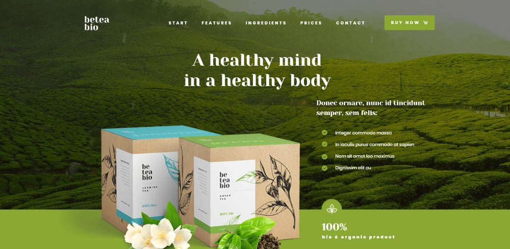
This is a well-organized website with bullet point content and a clear message. Users receive exactly the information they care about, without further complications.
Hello Alfred
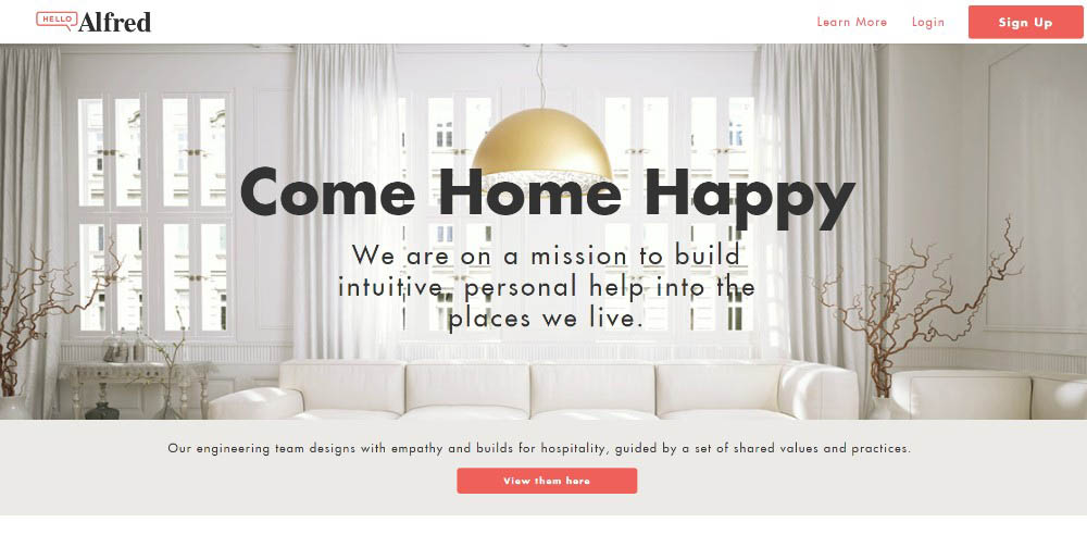
This website focuses on the main message, leaving irrelevant details behind. Information is very concise and presented in a visually-pleasing manner.
Be Cakes
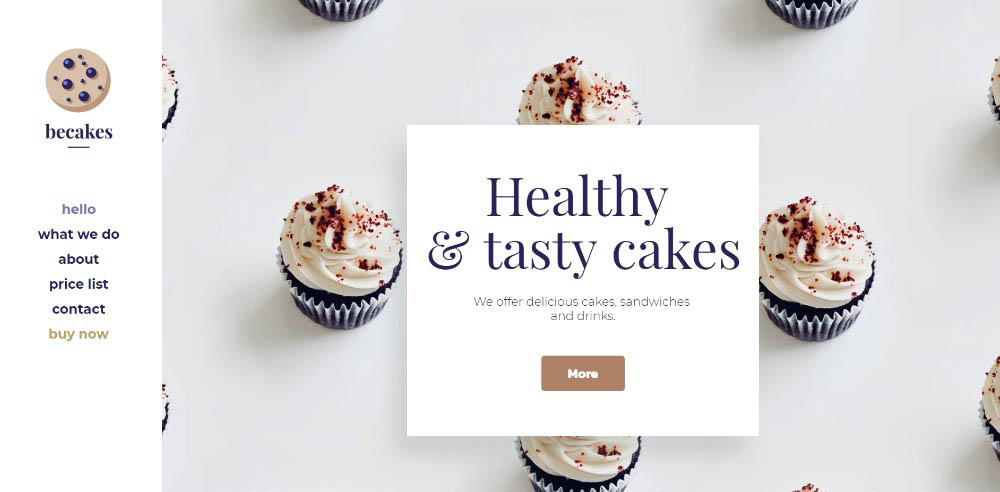
This is another example of presenting products in a simple manner that always stirs interest. The beautiful visuals and a limited amount of text are the elements which make this website successful.
Mercedes-Benz
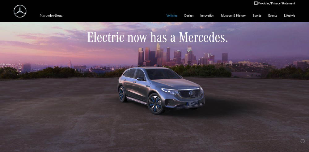
Selling vehicles is not the easiest task because of how difficult presenting them in an artistic manner is. Mercedes-Benz managed to set things right though.
3. Visuals and negative space
When people visualize a website, they use patterns. The main pattern for reading text comes in an F shape. While the one for images or other visual elements comes in a Z shape instead.
If a website is designed by following this simple rule, the eyes of the user will follow the direction. Using plenty of negative space makes
Here are several examples of using negative space:
Chris Connolly
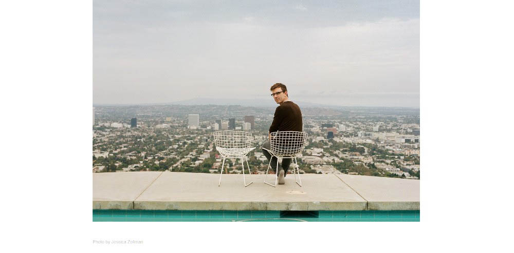
The use of negative space accentuates the main image, thus making the user reflect on the meaning behind it.
WeShootBottles.com
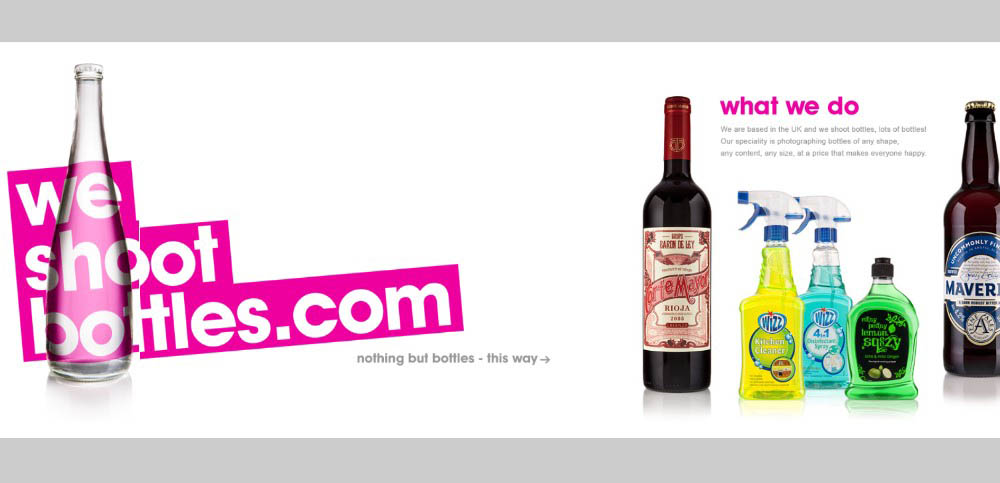
As the name says it, this website presents photography services for…bottles! Using negative space in this situation is a must to emphasize how clear and high-quality the bottle photos are. Without a white background, the website wouldn’t be as convincing.
Be Dietitian 2
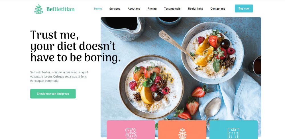
This is a pre-built one-page website that carefully brings together the visual elements. The layout is simple, yet convincing. The photos are well-selected, presenting the exact message that the website is trying to transmit.
Dribble’s Year in Review
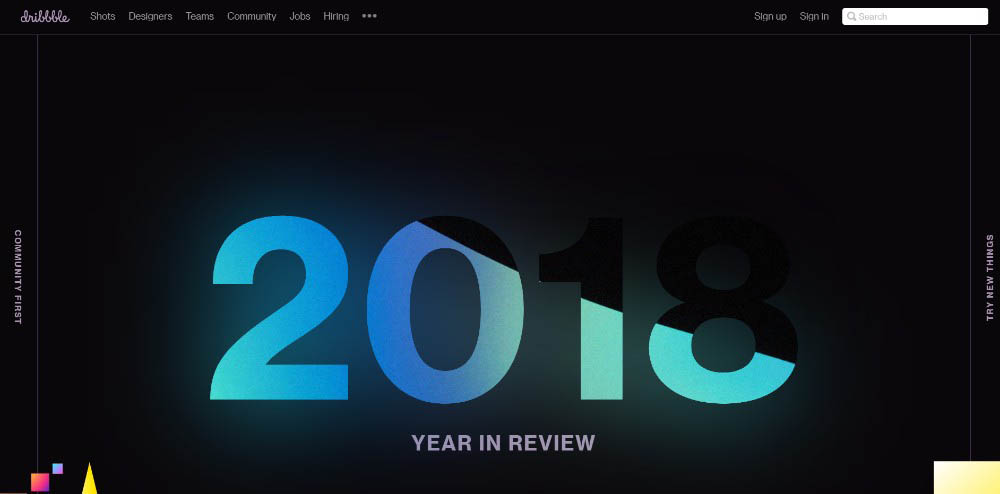
This website relies on classic design principles that give it an eye-pleasing look.
Nasal Drops
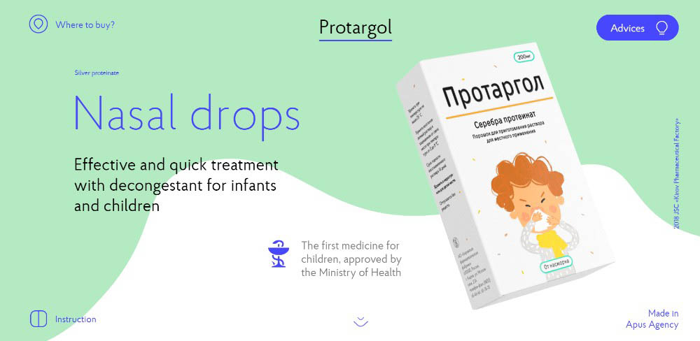
A simple website promoting a simple product – can’t expect much from it. Yet Nasal Drops breaks the mold and uses visuals ingeniously to present their product. The site beautifully combines both white space, product images, and animations.
Intuitive navigation and smooth scrolling
The website’s navigation is the one detail that users pay most attention to. The other elements are not as paramount as navigation on long-form one-page websites. Intuitive navigation that stirs curiosity is the result you should strive for.
The best approaches for one-page websites are using a horizontal stick menu. A sidebar menu works well, too. No matter how much they’ve scrolled, users can rapidly jump to another section. Auto-scrolling is a popular trend for one-pagers, too. The website will scroll directly to the section that the user desires to know more about. He/she should be able to do that with one click only.
Here are some of the most engaging navigation layouts used for one-page websites:
Sergio Pedercini
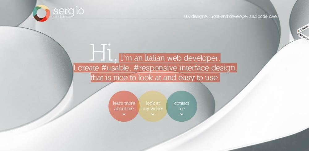
This one-page website only includes three different sections that users can click. Once they click one of them, the site will automatically scroll down.
Be Game
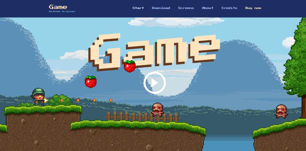
With such a unique navigation experience, users will definitely spend some time exploring the website.
Be Landing 2
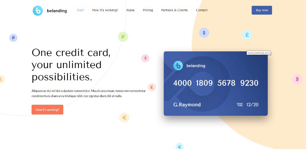
With a simple layout structure and a pleasing color scheme, this website is also very easy to navigate on. The information can be covered with three mouse scrolls only.
Brainflop
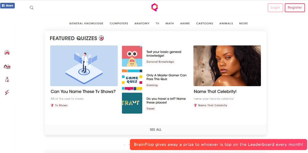
This website features a quick menu on the left and a detailed one at the top. This makes navigation very intuitive and comfortable, no matter how long the user scrolled.
5. CTAs
CTA (Call-To-Action) buttons are selected based on the purposes of the website’s owner. They are included in a website’s design to convince users to take action. Because one-page websites usually have one single purpose, selecting appropriate CTAs is easier.
Here are some examples of using CTAs:
Be Hairdresser
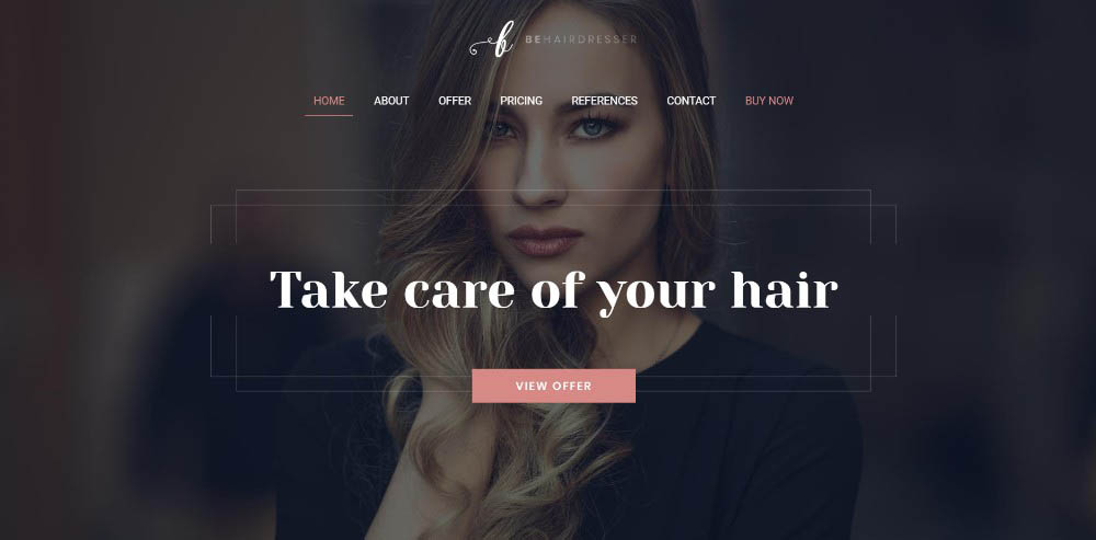
This is a pre-built website where the CTA button is above the hold. There is another CTA in the top menu of the website as well, beautifully blended with the rest of the categories.
The Art of Texture
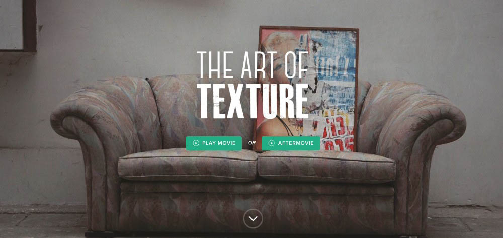
Here you can notice two different CTAs located above the fold. The users can choose between the two options for a quick walkthrough of the website.
Pyrismic
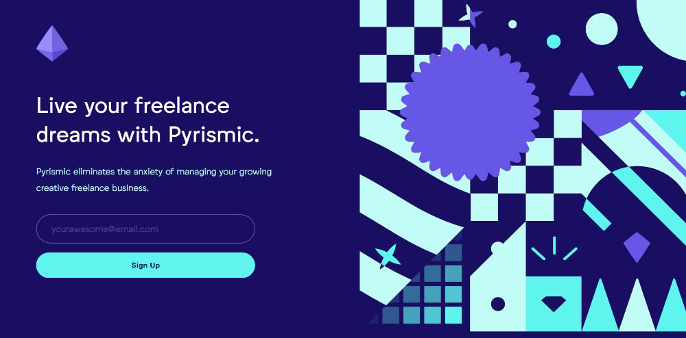
The main page simply features an opt-in form followed by a simple CTA.
Reneza
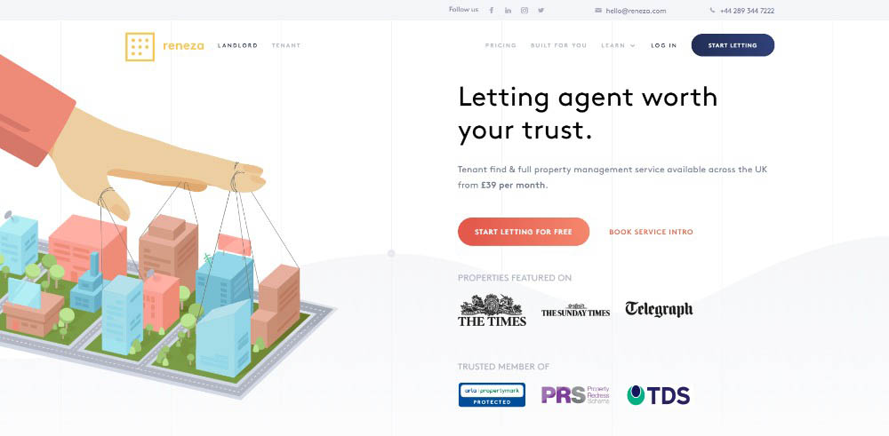
Users will be welcomed by a handful of CTA buttons here, but they are not at all spammy. Because of the proper color and text choices, the CTAs are both good-looking and efficient.
Final Thoughts
Now you know more about the essential 5 elements of building one-page websites. You can put together your own. Keep in mind that you will have to practice quite some time until you get things straight. But it is worth it eventually.
The principles seem easy to apply, but many factors can intervene. If you simply can’t get it right, consider using pre-built websites. They already respect the listed principles. They are as close as possible to perfection. One good place to start is Be Theme, a library of 60+ one-page website layouts that you can use immediately.


3 thoughts on “5 Factors That Can Influence One-Page Website Design”
Yes, Agree, Last year I was working with a Web Development agency, I have seen most of the web designers and developers following this one-page website trend.
Why?
Because it’s simple, clean and offers quite an impressive design
One page websites have become a trend for their strong and attractive design, simple navigation and easy development. Thank you for this interesting post!
One page websites are user friendly and easy to manage.