Web designers. Looking for some great assignments?
We have good news for you.
Because of opportunities created by today’s global economy, startups are popping up all over. Since many if not most of these young entrepreneurs are tech or digital-oriented it’s creating a need for more and more websites.
This situation isn’t likely to change anytime soon. Thus, it’s a good time to serve these new businesses by building great websites for them and reap significant financial rewards by doing so.
More good news.
It’s easy to create websites that are eye-catching, engaging, and more than capable of converting visitors into users. Doing so takes but 5 simple steps.
Take These 5 steps to Build Amazing Business Startup Websites
Step 1: Choose a mesmerizing color palette
It’s not all that difficult to select an attention-getting color palette, but when doing so you need to follow these simple rules:
Your color palette –
- needs to attract attention – instantly
- must be on-brand, and it
- must visually support the messages being put forth.
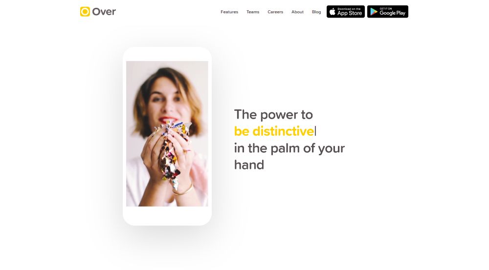
Over has BOLD color touches that immediately attract a visitor’s attention.
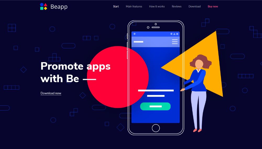
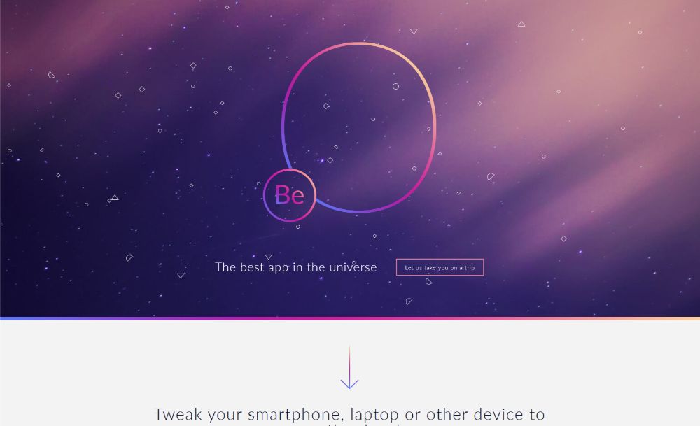
This Be Theme pre-built website provides another excellent example of an eye-grabbing color palette.
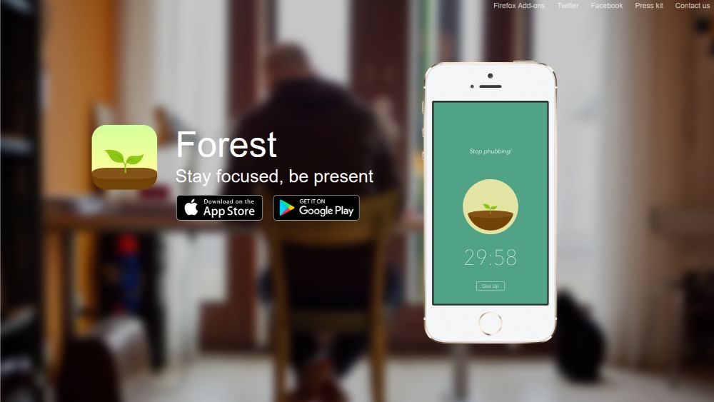
Forest does an excellent job at matching the color palette to its brand by featuring an abundance of earth colors like greens and browns.
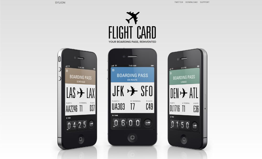
FlightCard, on the other hand, uses a subtle, cold color palette. It’s an ideal choice for reinforcing their message: boarding passes are now so simple to use you barely need to pay any attention to them.
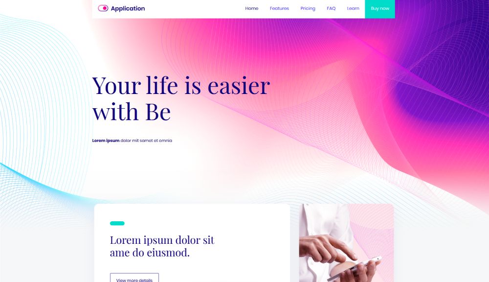
And, if you’re searching for a color palette that will appeal to a larger audience, BeApp2 is a perfect example.
Step 2: Display crystal-clear product pics
People don’t simply want an idea of what a new business has to offer them; they want to know EXACTLY what to expect. It’s important that these businesses clearly present their products and present them with a flair
After all, many of these startups have to compete with big businesses that have even bigger budgets; and they need that extra edge.
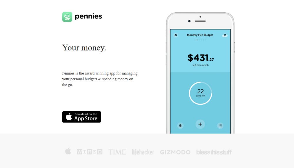
Pennies takes pride in displaying how the site appears on a smartphone. These images aptly illustrate how easy it is to use. You can even make out how the color codes work.
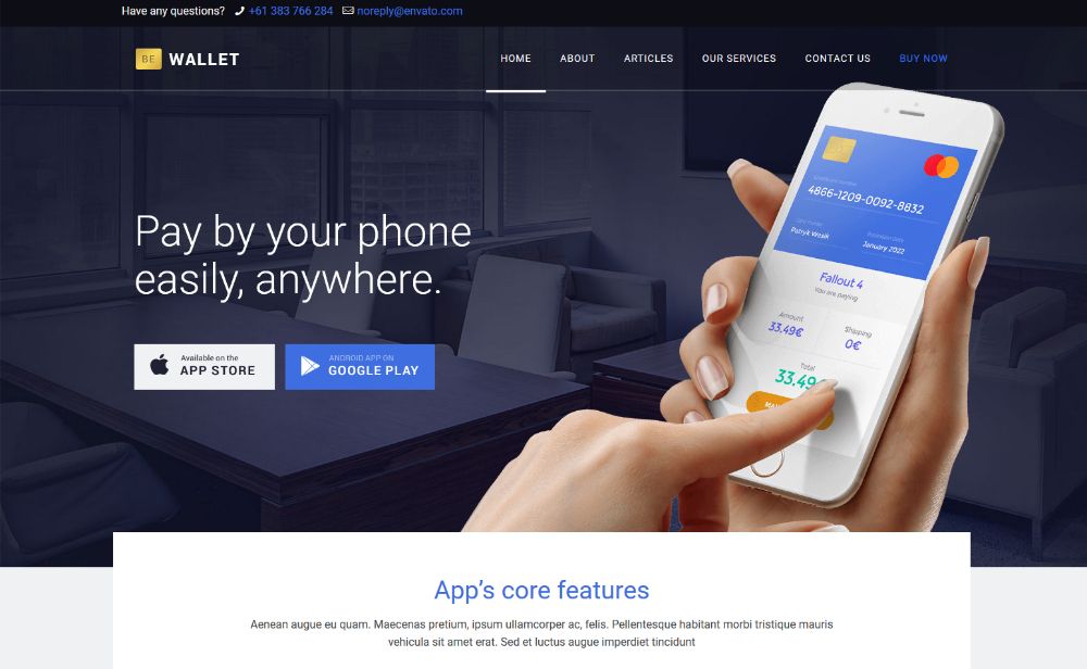
You can do a website like the preceding one with BeWallet. This pre-built website was designed from scratch for use by financial service startups. The good news for you is that there are SO many out there in dire need of a better website).
Or, you could select a more generic pre-built website like BeSoftware to provide a crystal-clear presentation from a new business startup.

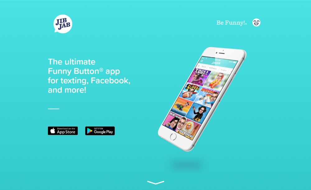
JibJab takes things a significant step further. It shows the before & after a simple, yet compelling and persuasive tactic to show what the startup offers.
Step 3: Show visitors how the new startup serves them
People like to know “what’s in it for me?” Helping them to imagine themselves as actual customers is a powerful tactic worth keeping in mind.
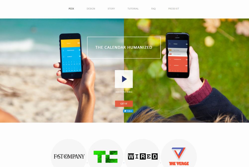
PeekCalendar has a hero section video that illustrates how customers can benefit from various aspects of the new business.
BeApp3 allows you to incorporate both product pics and video. You can do this to show people exactly how the new business’s products and services will benefit them.
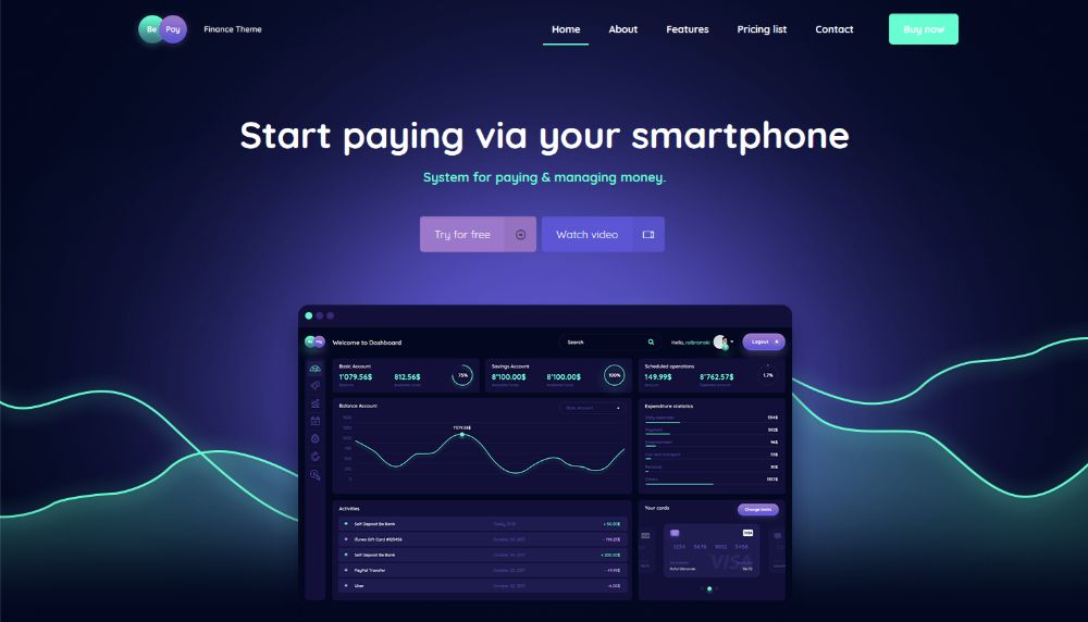
BePay places a Watch Video CTA button right above the fold. This enables visitors to view a product demo right from the start.
CutestPaw will melt your heart. This pet lover’s dream of a website’s “how-to” is cleverly rolled up into a single image. We have there a hero shot that illustrates how the startup will meet a customer’s specific need.

Step 4: (Over)use “white” space
It’s almost impossible to use too much white space on a startup website. Or at least, that's how it seems since white space is often the most important visual element of all. The following examples clearly illustrate why this is the case.
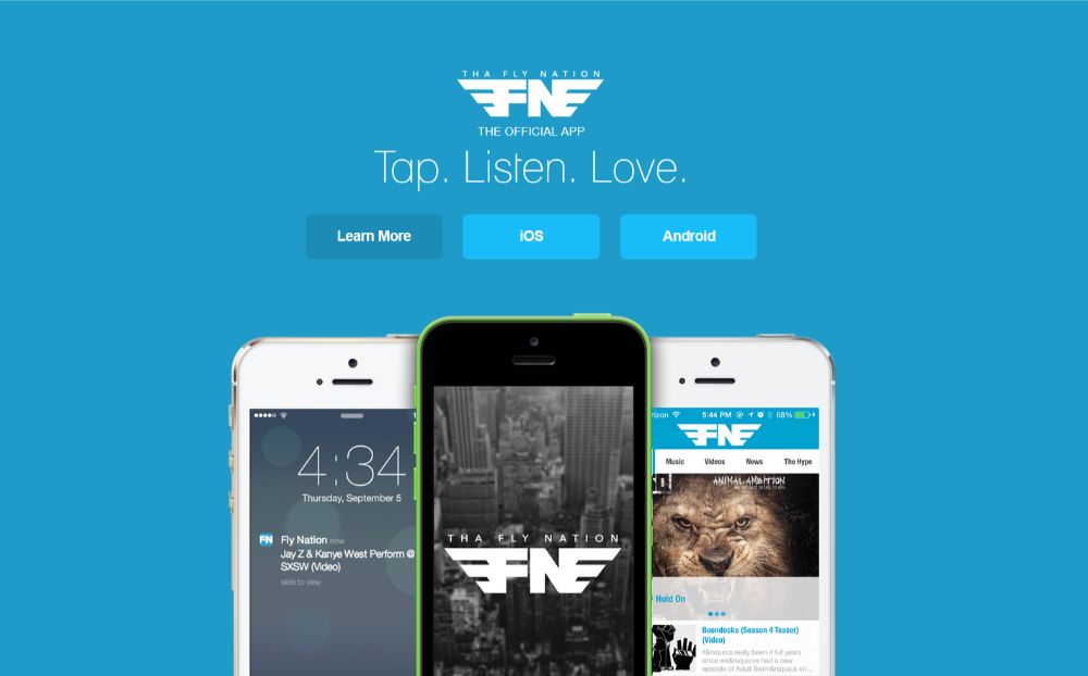
Tha Fly Nation has a clean, airy, and minimalist design that allows the eye to focus on what’s important.
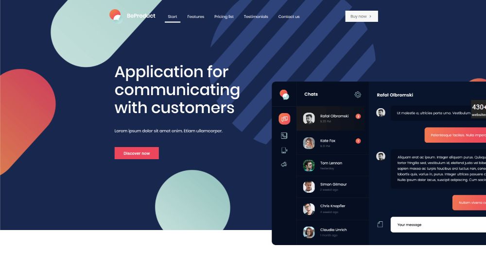
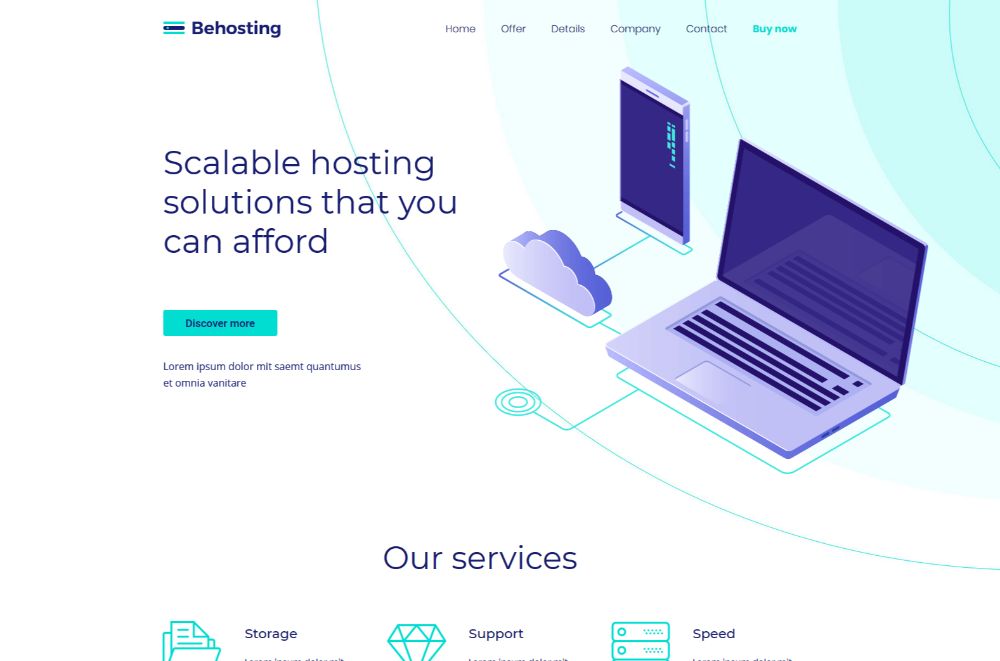
You can create a similar startup website if you use either BeProduct4 or BeHosting2. These are two pre-built websites that effectively use white space to enhance user experience and emphasize a page’s critical elements.
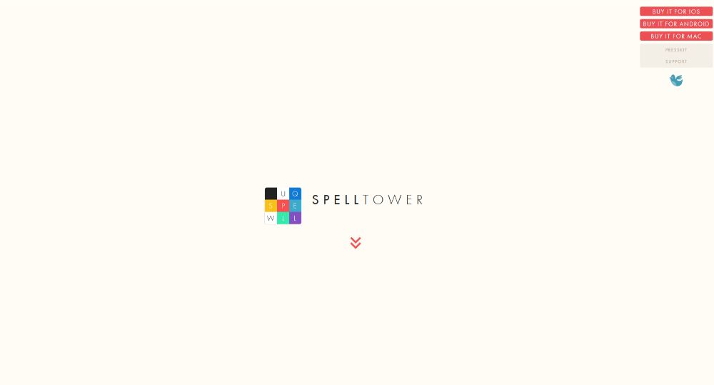
SpellTower could well be THE most extreme example of effectively using whitespace you’re likely to find anywhere. It goes with their brand and drives the message home like none other.
Step 5: Make your CTAs grab them by the eyeballs
Want to do a better job of converting visitors to users? Try incorporating CTA buttons that are so bright and bold that visitors will click them just to avoid the bright glare. That’s obviously an overstatement, but you do want to gain their attention and compel them to click.
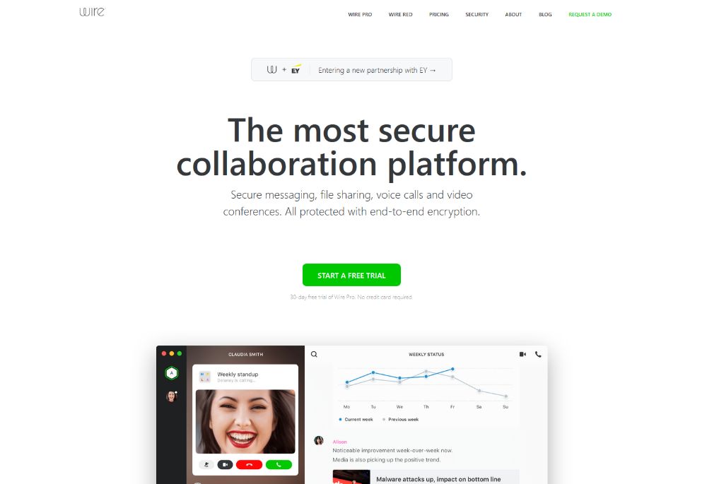
Wire’s CTA button clearly stands out with its bold color and a size that’s big enough to draw attention to it the second you’re done reading the headline. And, since it’s placed in the center of the page, it acts like a “gate” that needs to be clicked to move forward.
BeERP uses an identical bright-green button for its main CTA; the one you want visitors to click. A secondary plain CTA button is positioned to the right.

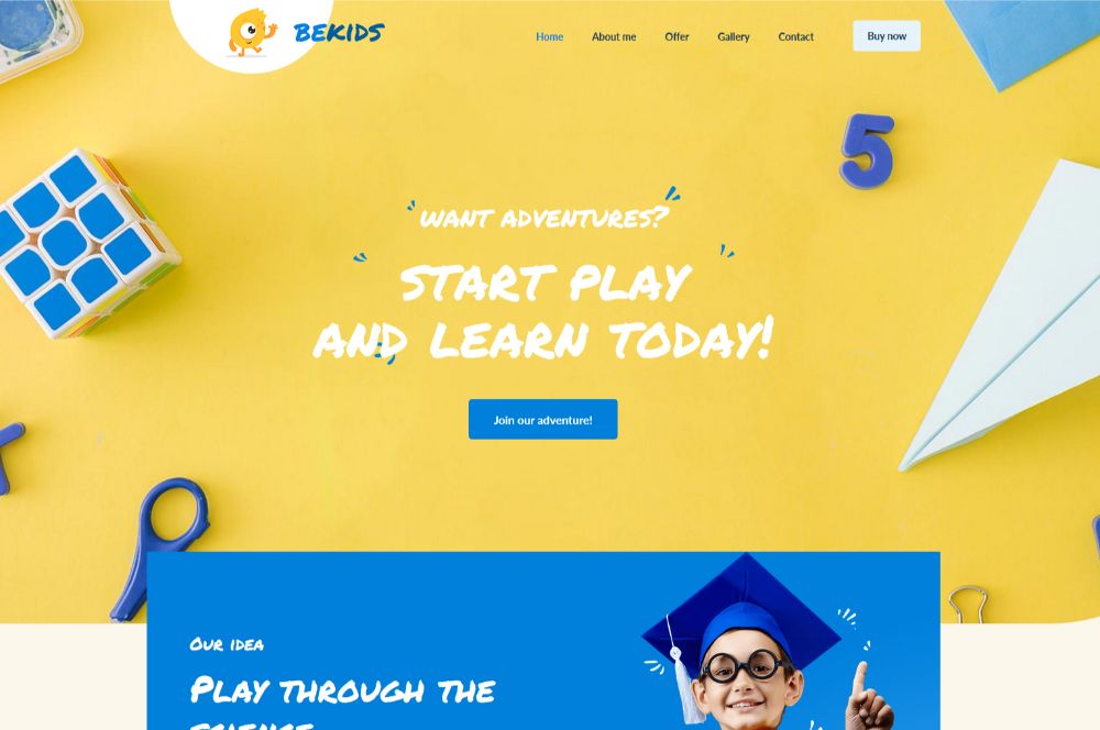
Another effective way to direct attention to your CTA button is to match its color with that of other elements on the page. BeKids is a great example of this, where the blue of the CTA button matches several of the hero section’s visual elements.
Conclusion
These surefire steps and ideas will help you build a startup business website that’s both eye-catching and built for conversion.
Follow these simple tactics to create a website that will attract attention with its stunning visuals and clever use of white space for one. And it will also persuade the right audience to use the services and products offered by the new startup.
If, yet, you find you’re having to juggle many projects, or you’re working under a tight deadline, you can enjoy using a pre-built website that’s built from the ground up for startups and small businesses.
You’ll find Be Theme’s gallery to be most generous, with its more than 450+ pre-built websites to choose from, each of which you can customize to your liking.
These pre-built websites are both functionally and visually impressive, with interactive elements, stunning effects, and intuitive navigation. All you need to do is personalize it to fit your business and you’re good to go!