
How can you avoid creating a website that looks great on some browsers and devices, but is close to if not a total disaster on others?
These responsive web designs should give you a good idea as to how to go about it.
There’s no escaping the fact that there’s always been a host of design specifications and requirements you have to satisfy to avoid disappointment. That’s simply how web design has evolved.
Responsive web design requirements have made things even more complex.
A smart approach is to strictly follow a checklist as you create your design. Once everything has been checked off, you should be where you want to be – at least most of the time.
An even smarter approach is to use a WordPress theme like BeTheme that either makes it a piece of cake to check off the requirements and specifications as you go along or simply does it for you. There’s much less work involved, and eventual success is all but guaranteed.
With respect to responsive design, “guaranteed” should make you feel good because (1) the use of mobile devices now exceeds the use of desktops and will continue to do so, and (2) responsive websites are now looked upon with increasing favor by the search engines.
Responsive design is no longer an option. It’s a must.
Keep in mind however, that although responsive design has become a virtual necessity, you still have to keep desktop users happy.
Leaner Desktop Experiences – A Somewhat Unexpected, but Pleasing Result
The challenge of going from a desktop to a mobile viewing experience is that of displaying the same key information in a smaller space in a way where it is still every bit as effective.
In other words, it’s not a matter of “cramming”; as you will see.
Going in the other direction, mobile to desktop, has resulted in cleaner, leaner, and more open presentations of key information.
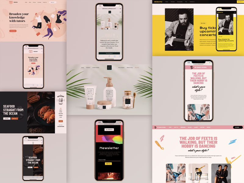
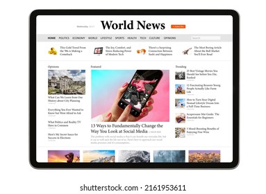
Take the example of designer/developer Rob Grabowski’s website.
First, how it appears on a mobile screen:
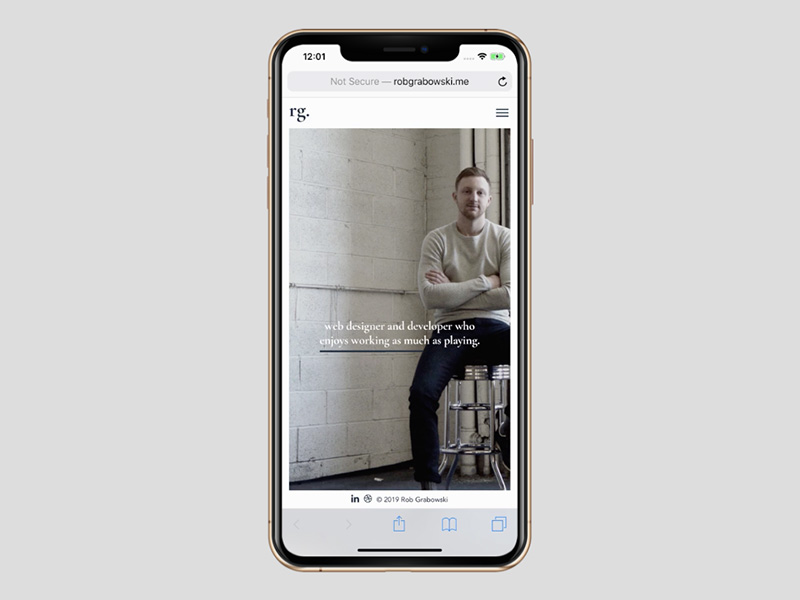
And then, on a desktop:
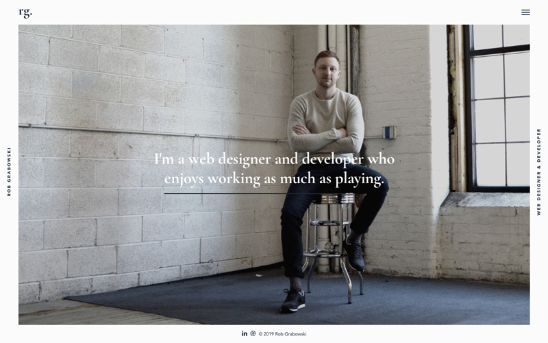
Nothing is lost (unless you’re a big cinder-block fan) when going from the desktop to the mobile version. The desktop version on the other hand remains pleasing to the eye.
That’s what consistency in design enables you to do.
Modularity as a responsive design option.
The beauty of a modular design approach is that it encourages designers to think of a web page in terms of sections, and the relationship of each section with the other sections. Sections can be rearranged and displayed in a fashion that allows users to review one decision-making option at a time.
The BeRepair pre-built site from BeTheme illustrates this approach:
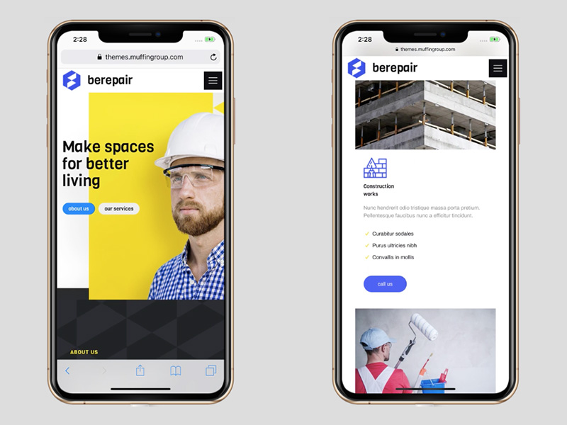
Merely shrinking a desktop version would create a confusing jumble and an overload of information.
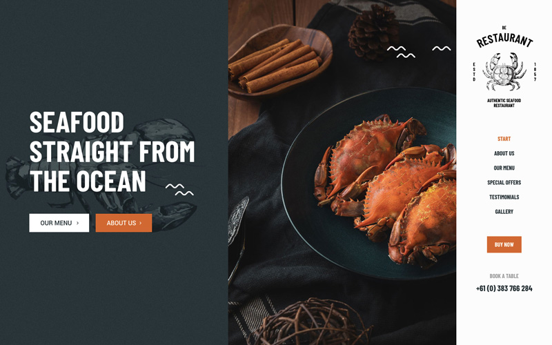
BeRestaurant is another example of how a modular approach works. Going from this, the desktop version:
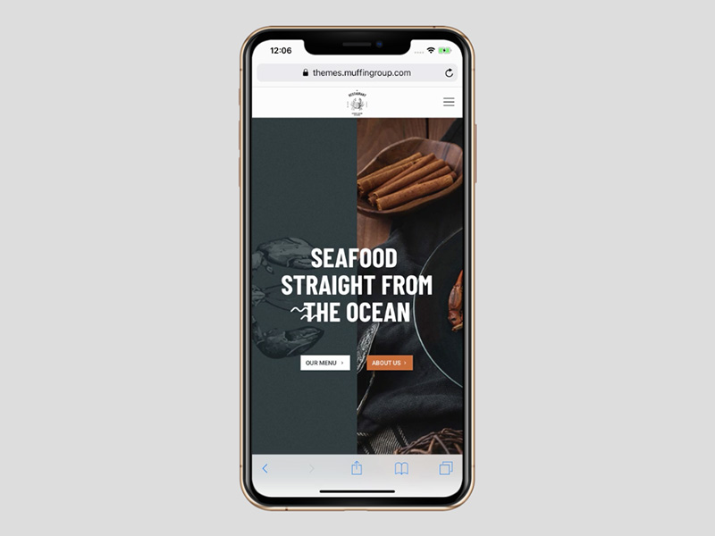
To the mobile version, in which the core elements of the message are maintained.
A Second Responsive Design Option – Cutting Out the Excess
As rich in detail as a beautiful landscape painting may be, it usually has a central focus. If it’s a true masterpiece, you don’t really want to cut any of it out.
Raphael’s “School of Athens” has often been subjected to cropping, for whatever reason. The focus remains on the two key figures, Plato and Aristotle, but when the mural is allowed to be cropped, the story this famous work of art tells changes completely. There is really no “excess” to cut out.
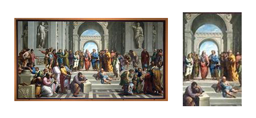
Fortunately, we’re not often faced with a situation like this in responsive web design. More often than not there is quite a bit of content that can be trimmed away without creating any damage whatsoever.
With web design it’s a matter of knowing what can be looked upon as excess in a desktop display so it can be trimmed back enough to create the desired mobile experience – as BeTheme’s BeITService does with its desktop site.
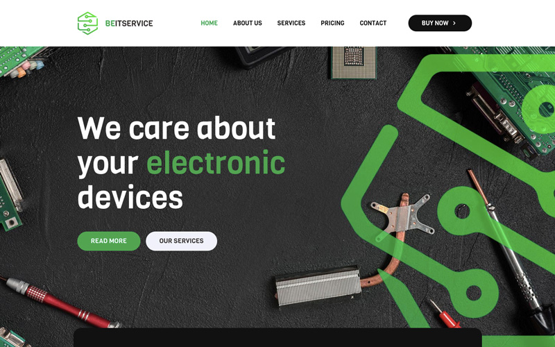
This is a great looking homepage banner. You wouldn’t want to cut out any part of it unless you must. Unfortunately, to display this page on mobile, you have to.
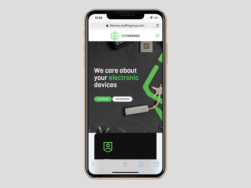
As it turns out, the result is not as bad as you may have feared. The banner is still attractive, and you didn’t lose any key information.
Culturally Connected does something similar with its desktop display.
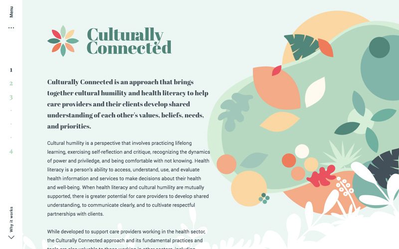
Converting this design to mobile by simply removing the image to go from a landscape to a portrait format wouldn’t work, however. For one thing, merely shrinking the text would definitely be a bad idea, so the web designer did the following instead:
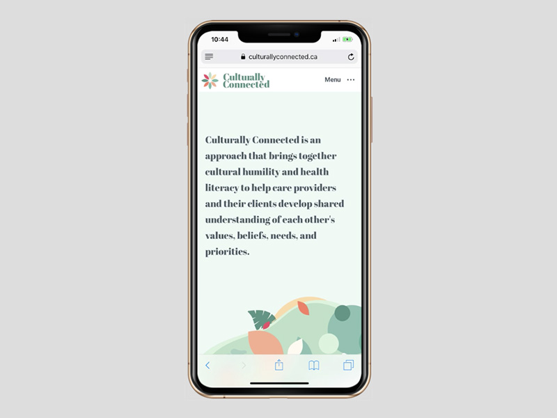
If anything, the message comes across even more clearly on a mobile device.
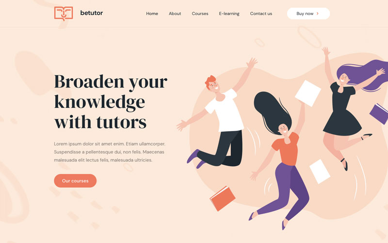
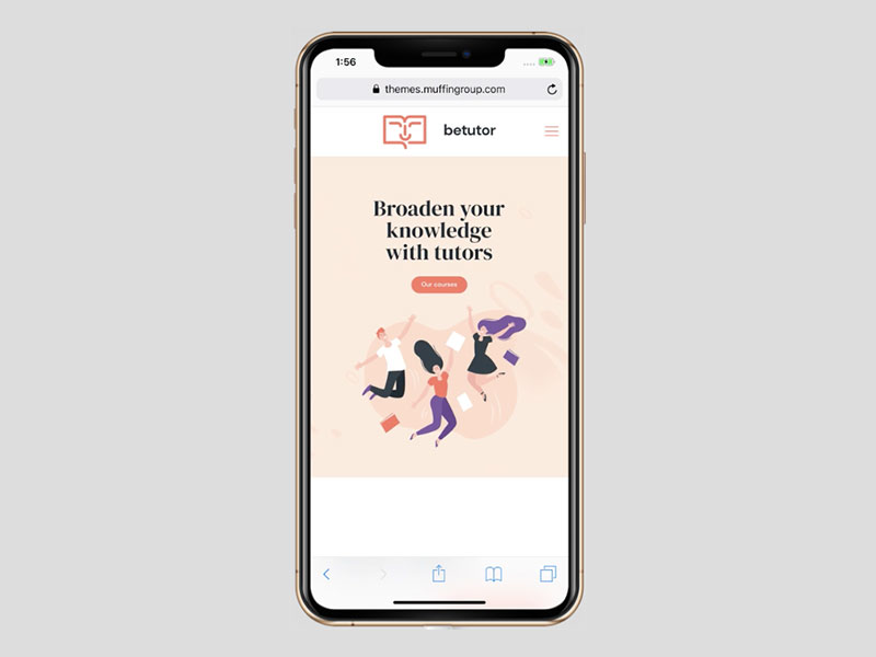
Or, take BeTutor as another example:
In this case, the smaller textual content and much of the white space has been removed and the message has been relocated. Giving you this:
Leveraging Space is Yet Another Option
Although reducing content to accommodate small screen sizes is often sufficient, leveraging space by working with different ratios gives a web designer a workable option when simply shrinking content doesn’t work.
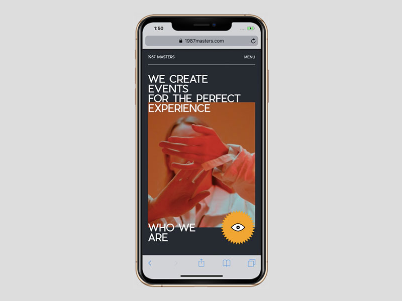
1987 Masters is an example of leveraging space.
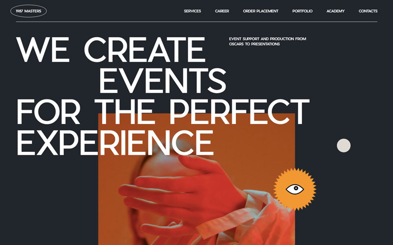
In addition to cutting away unused space, the text message is not only altered but, arguably, improved in the case of the mobile presentation.
Instead of showing less content, leveraging takes existing content and reconfigures it to fit.
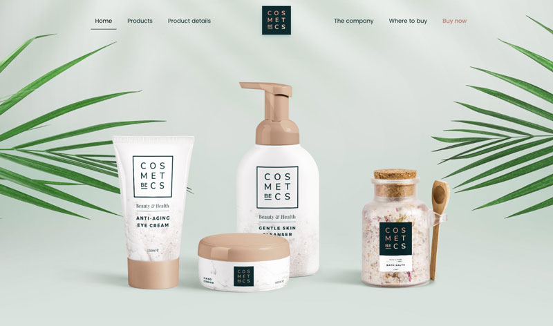
BeCosmetics is another example of the positive results leveraging can achieve.
First, the desktop view:
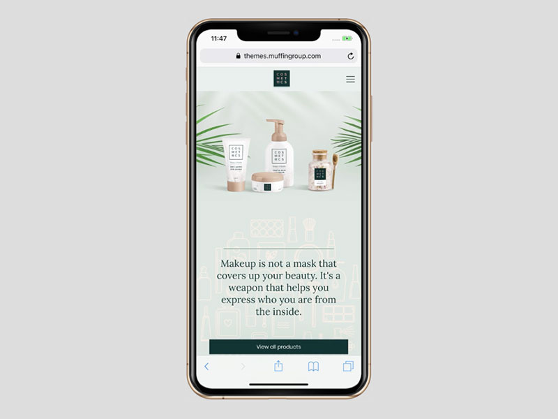
Followed by the mobile view where the extra vertical space available can be put to good advantage.
Through Careful Design, Superior Readability can be Achieved
When laying out text for a desktop website it can be easy to show a reader more content than can quickly and easily be absorbed. Too many words can turn a reader off. This could happen with a mobile site as well but is less likely since text tends to be used more sparingly in mobile design.
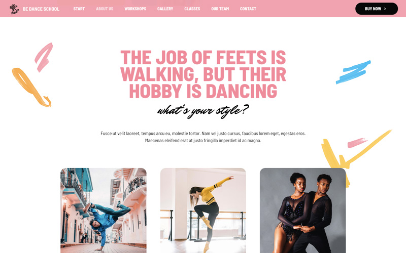
The desktop version of BeDanceSchool provides quite a lot of information without overdoing it.
It’s obvious that not everything will fit on mobile. For one thing, much of the text would with have to be impossibly small or the images would have to be too small to contribute to the message.
The solution.
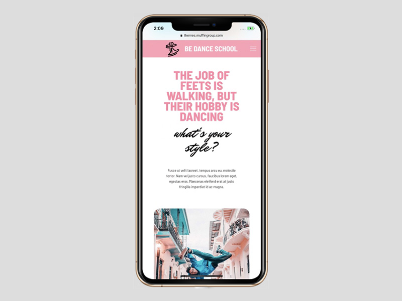
The content the reader needs to see remains. The mobile version could conceivably be improved even more by making changes in the font.
Base Coat relies less on beautifully styled and more conventional font to get its message across.
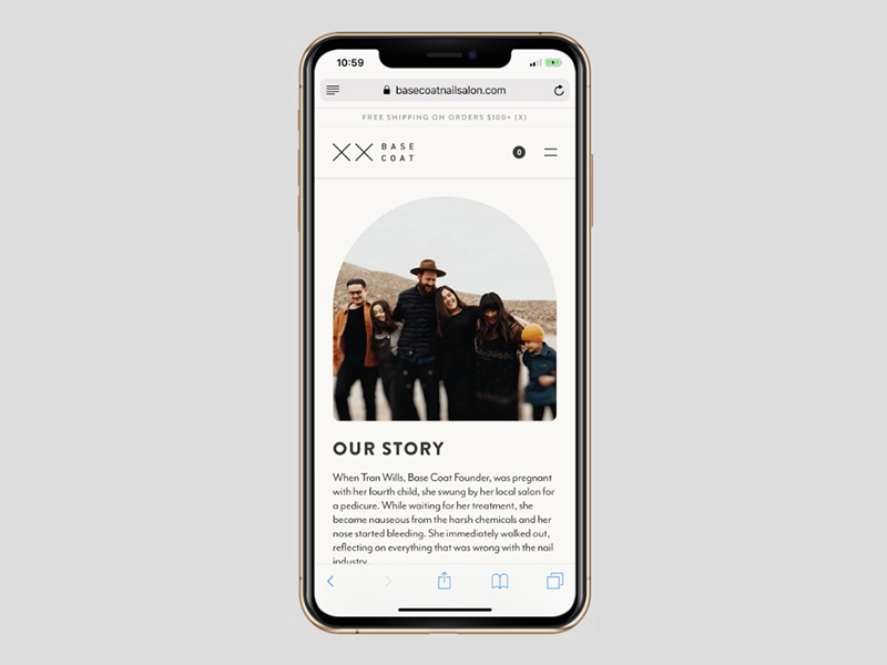
You do have to be careful about use of the vertical length of the text. It might be quite easy to see where it will end on desktop, whereas it could continue and subsequently be cut off in mid-sentence on mobile.
Placing the Spotlight on Visual Content
Mobile screen displays are perhaps most effective when the focus is primarily on an image and to a lesser extent on text. You can have both, but images have a wonderful way of introducing or telling a story.
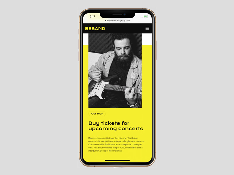
First, see what BeBand does on desktop.
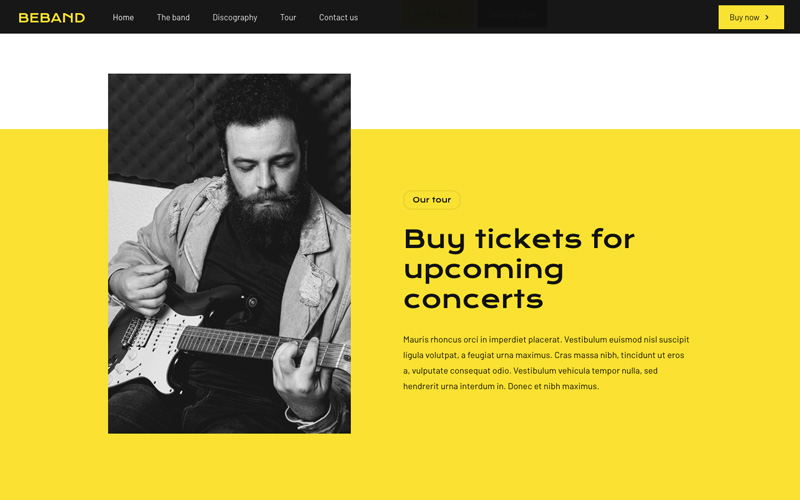
Placing the text below the image for mobile gives the visitor the same information and at the same time effectively spotlights the image.
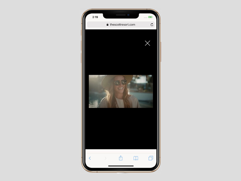
The benefits achieved in spotlighting a static image apply to videos as well. The Scott Resort invites its first-time visitors to view a video.
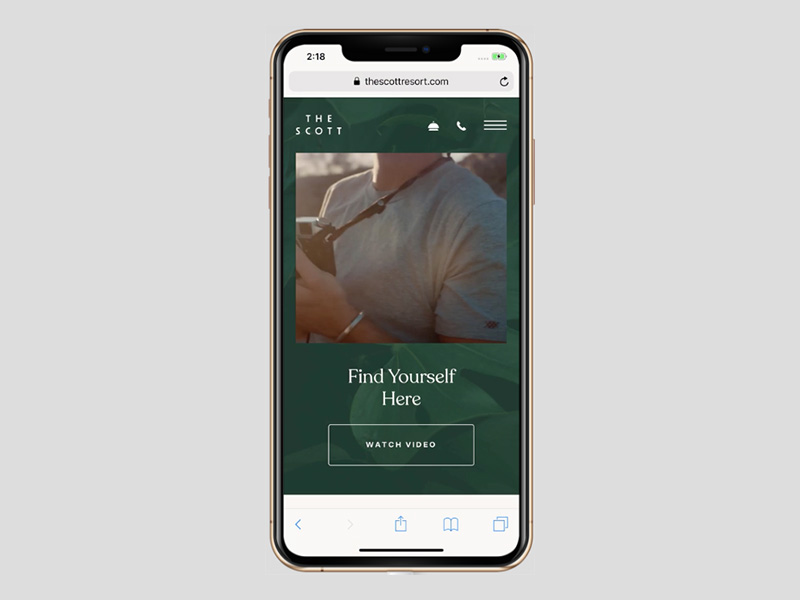
The video nicely conforms to the width of the screen. On desktop it looks like this:

And, on mobile it looks like this:
Responsive Design Aimed at Collecting More Leads
At the current state of the art in website design, desktop users are more apt to convert than mobile users; simply because it’s much easier for them to do so. There’s no design trend or technique out there yet that’s guaranteed to make your mobile site a superuser converter, but there are still some things you can do to capture more leads.
For starters, tale the BeClub pre-built site.
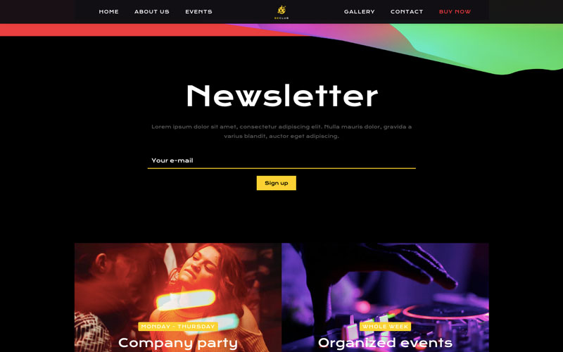
“Newsletter” stands out, and since only takes one field to sign up it stands a good chance of getting a ton of subscribers (which can of course create new leads).
On mobile, it looks like this:
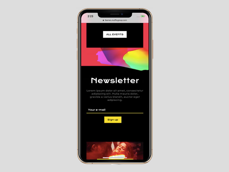
It’s more compact as would be expected, but that can actually be a good thing since “Sign Up” is given greater emphasis in which case mobile could even outperform desktop!
What Makes a Winner? It’s Giving the Mobile Crowd What They’re Looking For
In other words, well-designed responsive websites. And, when WordPress users choose a theme to use, they base their decision of the following:
- Features
- Cost efficiency and effectiveness
- Design quality, including ease of use
- Flexibility and customizability
Most WordPress themes nowadays are responsive, or at least claim to be. Still, not every WordPress theme’s design takes the mobile user into account.
BeTheme does so with each of its more than 500 pre-built websites. They have mobile responsiveness baked in they are customizable, easy to work with, and genuine time-savers as well.
If you like what you’ve seen in the above examples, consider investing in BeTheme. You won’t be disappointed.


