Landing pages are a critical part of any marketing funnel. Whether you’re an entrepreneur selling a single product or a company promoting a new offer, landing pages are an essential part of your sales strategy. The great news is that designing great landing pages is more science than art, thanks to the metric-driven approach that dominates digital marketing.
The key to designing a great landing page is to test all versions as much as possible. Hubspot’s research shows that companies with 10-12 landing pages have 55% greater conversion volume than entities with a lesser number of pages. When creating that many landing pages, design processes can get complicated in a hurry.
Luckily for online businesses, software providers like Elementor simplify the process of designing great landing pages. Here are 3 steps that will simplify landing page design and boost your conversion rates.
Define your goal
Source: Elementor
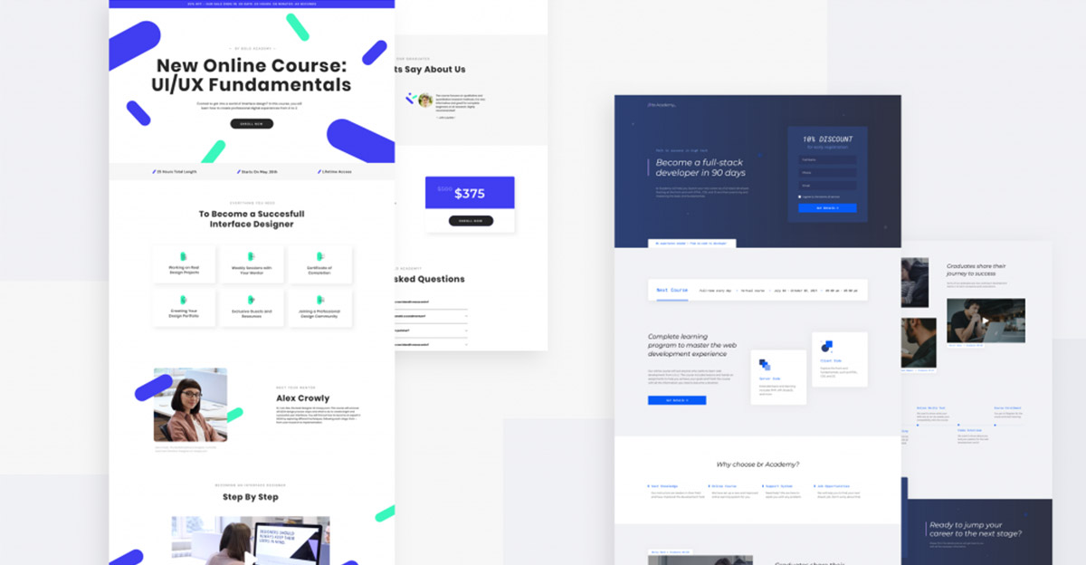
Landing pages tend to be lengthy, and it’s easy for you to lose track of the intention behind creating the page. Sure, you want to drive sales, but how are you convincing prospects to buy your product or service? Which pain point are you targeting? It’s essential for you to answer these questions before diving into landing page building software.
Landing pages need to be tightly focused and communicate their value to your reader quickly. For instance, your headline above the fold must focus on the pain point and the solution in a compact manner. Your offer should be prominently displayed, and you should not link to more than one lead magnet.
Typically, landing page owners have more than one lead magnet. In this case, you should create separate pages for each lead magnet instead of bundling them into a single page. By splitting your offers, you’ll communicate more value to your audience and avoid confusing them. Keep it as simple as possible. As part of Elementor’s 3.1 release, split testing landing pages is not easier than ever.
The advice to split test extends to the copy as well. While it must encourage people to take action, avoid becoming pushy about it. For instance, pushing people to “click here” all the time will only turn them off. You should describe the benefits of your product in niche-appropriate language that your audience understands.
A common mistake creators make is to sweat over the right theme endlessly, describing the product in great detail, using lengthy paragraphs. While this covers all aspects of your product, it isn’t the most readable format. Trim your copy and remove any unnecessary words and phrases from it. Stick to addressing the major pain points, communicate a single offer, and you’ll erase most of your design problems immediately.
Optimize for speed and responsiveness
Source: Elementor
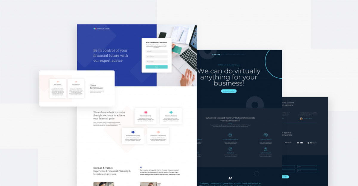
Elementor’s landing page templates make a creator’s task easy. These days, page speed and asset optimization is a critical feature in landing page design. Landing pages typically have a range of web assets such as sign-up forms, videos, high-res images, testimonial boxes, columns containing text, lightboxes, pop ups, and so on.
When bundled together, all of these elements decrease page performance. Providers such as Elementor don’t just focus on providing beautiful design templates they also optimize everything under the hood. For instance, Elementor’s landing page templates employ selective asset loading. This means bandwidth-hungry videos and images load only when the visitor clicks on them.
The result is fast loading and optimized code that boosts SEO rankings. Platform responsiveness is a key factor in SEO rankings these days. Users access pages from as many as 7 devices, and choosing an unresponsive template can doom your campaign before it even begins.
Elementor’s designs are highly responsive and customizable. With a few clicks, creators can ensure their pages are optimized for every device and that all assets are working as intended.
Test CTAs
Source: Elementor
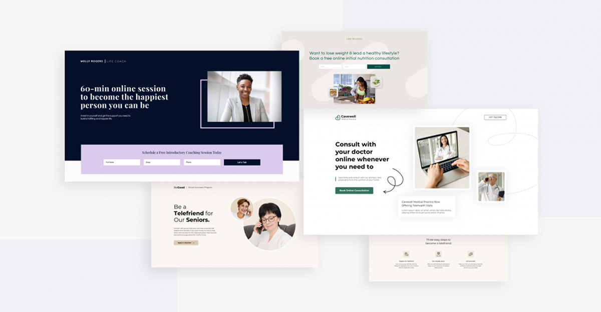
CTAs are the most important part of the landing page. These elements are the ones that seal the deal for you and all of your page’s copy build-up to the CTA. While it’s tempting to brainstorm everything from the button color, shape, and text all night long, it’s far better to create multiple versions of your page. Test all of these versions to see which one gives you the highest conversion rate.
Creating a single CTA and spending time perfecting it is the biggest mistake beginners make. Landing page design is a science, and you must test every option. At the very least, make sure the text and CTA color contrast each other. In addition, your CTA must stand out prominently from the page’s background.
While common advice says you shouldn’t have boring CTAs like “Contact us” or “Submit”, much depends on your niche. Some niches, such as B2B services, require “boring” CTAs. The only way to figure your choices out is to test multiple versions of your page.
Many choices, one winner
Repeated testing will reveal the best landing page design for your product. Remember to remain focused throughout your page and give your audience as much value as possible. Offer social proof when appropriate, and you’ll have no trouble designing great landing pages.
While most people focus on the design elements, you need to prioritize what’s under the hood as well. Use the right template provider and make sure your design is responsive. Follow these 3 steps, and you’ll create great landing pages in no time.


