Looking for that small, yet valuable element that will change the entire looks of your web design? Altering the typeface may be the answer!
Besides, the options are just endless! You can choose the traditional sans serif, or go for something much more elegant, as for instance letters with flourishes and long tales. The good news is that the spectrum is not becoming narrower any time soon.
Another advantage of typefaces is that there are no strict rules to consider – you get to decide which one you prefer, either from the list of most popular fonts or among the less known ones. That’s in fact how designers get inspired to create a new font for every project, and they rarely charge for it.
As an observer, more than a designer, you are aware of the mind blowing amusement fonts can cause in web design. That’s why you should not neglect the importance of choosing an appropriate one for every web project. The experience will be even more exciting because of the fact that even most beautiful fonts are for free.
The purpose of this article is to compile the best free fonts you could use for your next project.
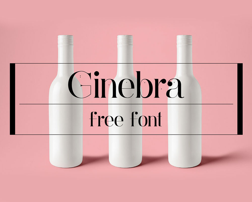
Ginebra
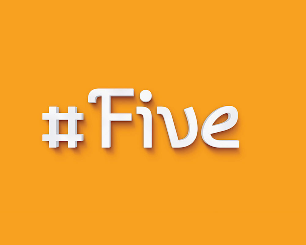
Five
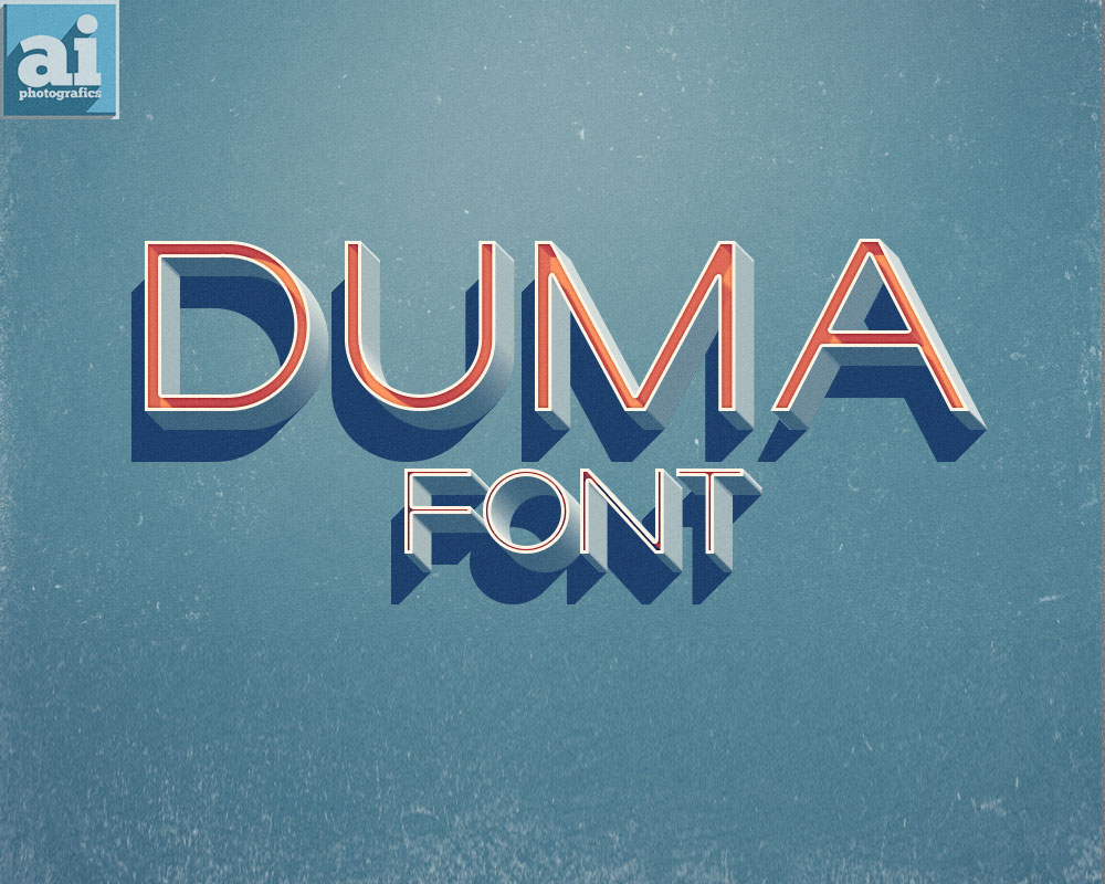
Duma
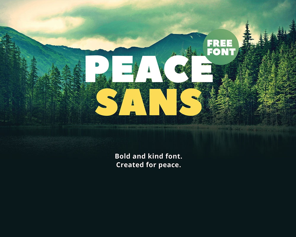
Peace Sans
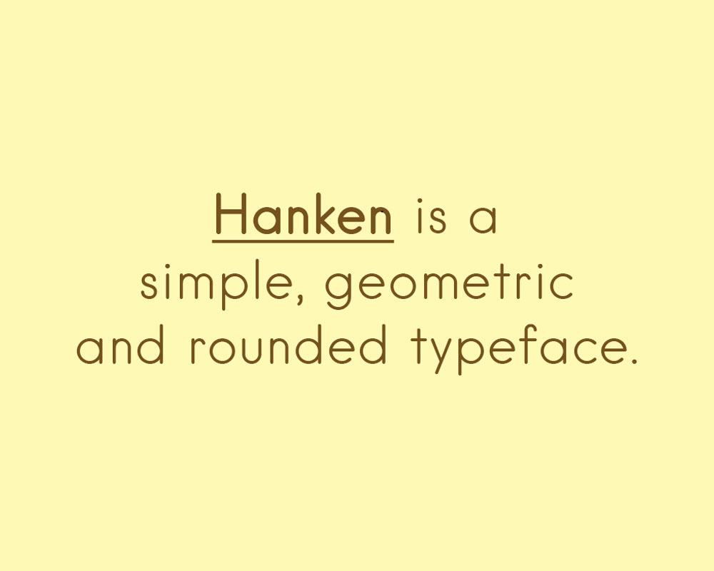
Hanken Round
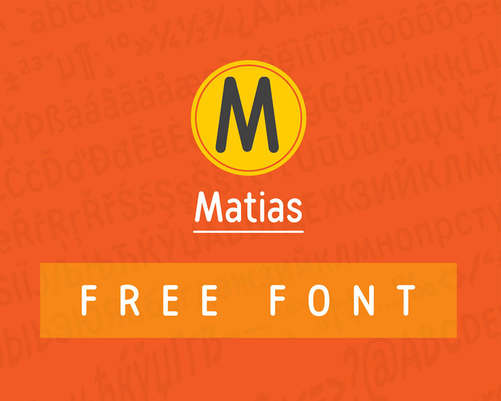
Matias
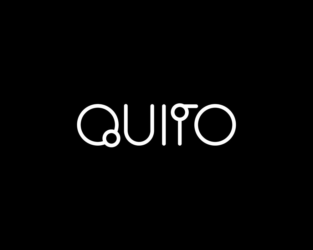
QUITO
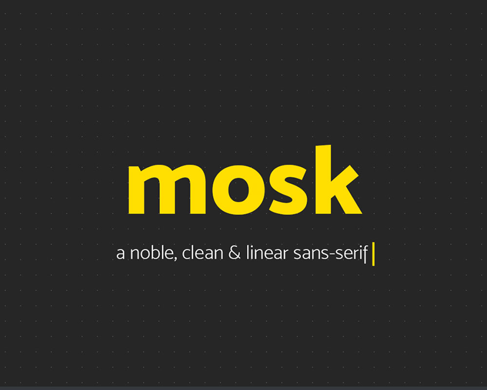
Mosk
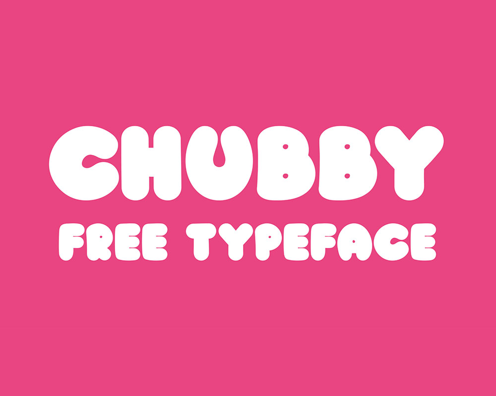
Chubby Free Typeface
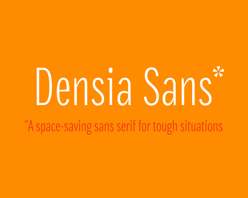
Densia Sans Typeface
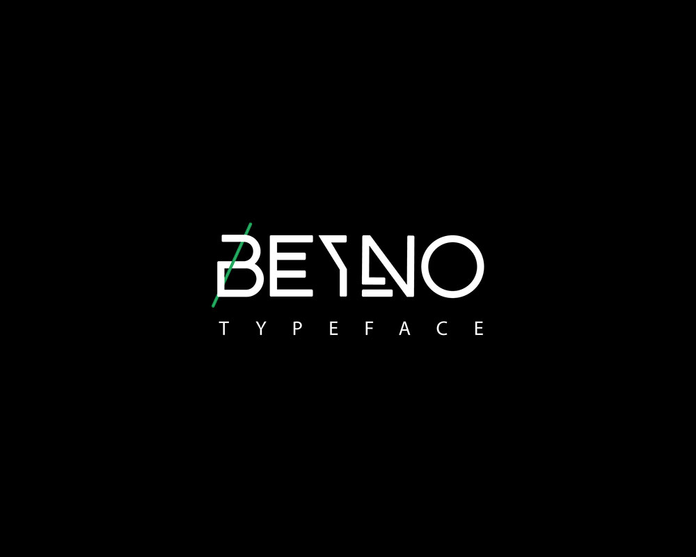
BEYNO
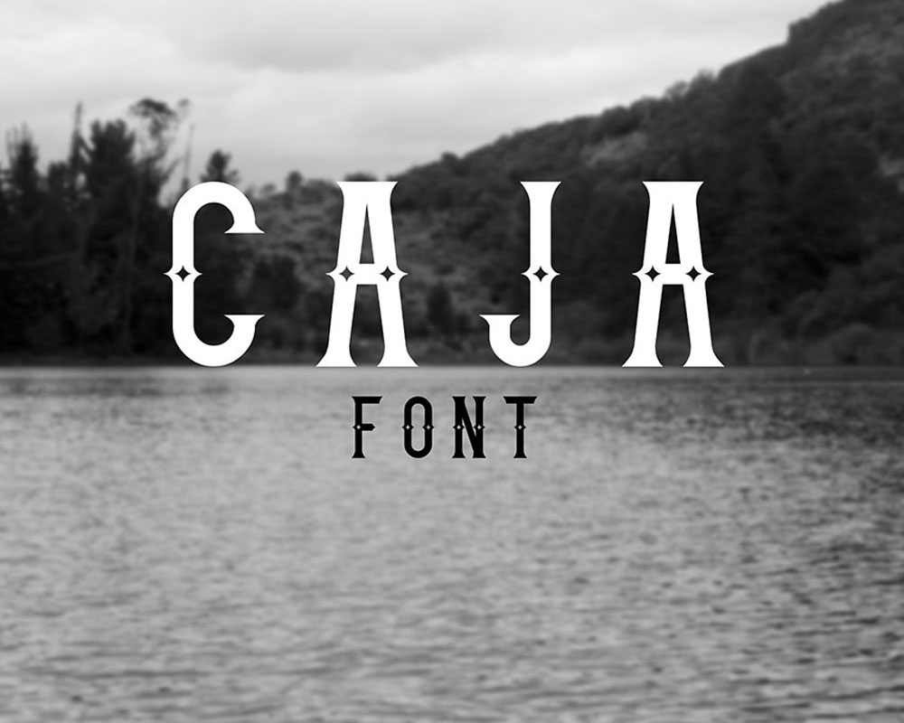
Caja
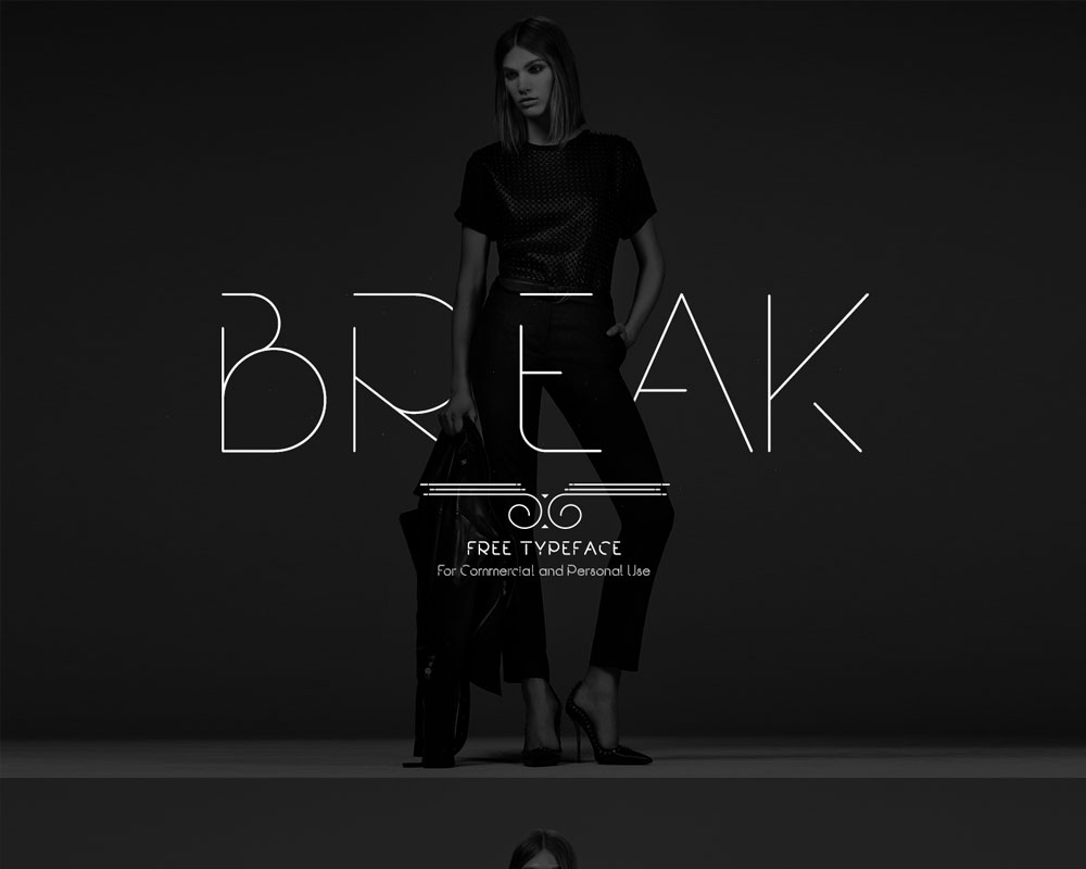
Break Free Font
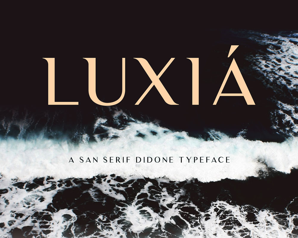
Luxia
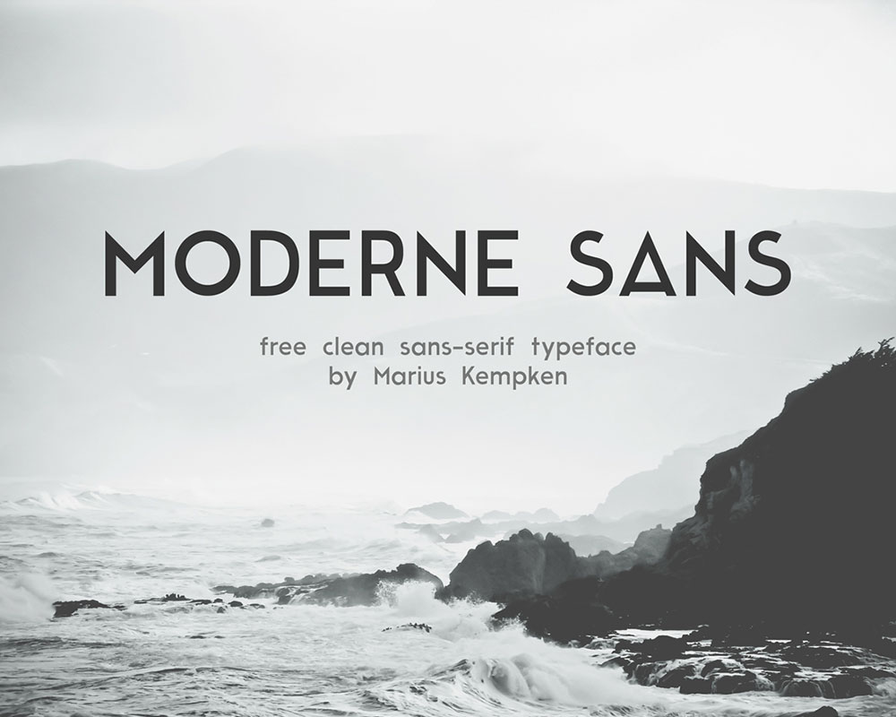
Moderne Sans
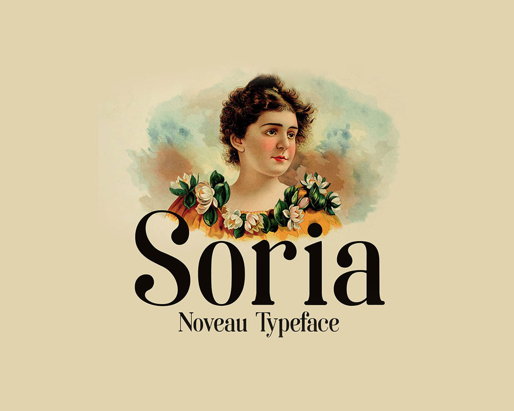
Soria
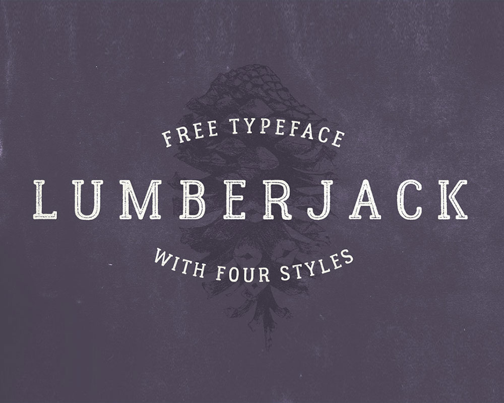
Lumberjack Free Font
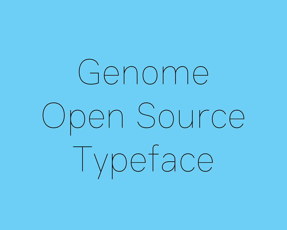
Genome
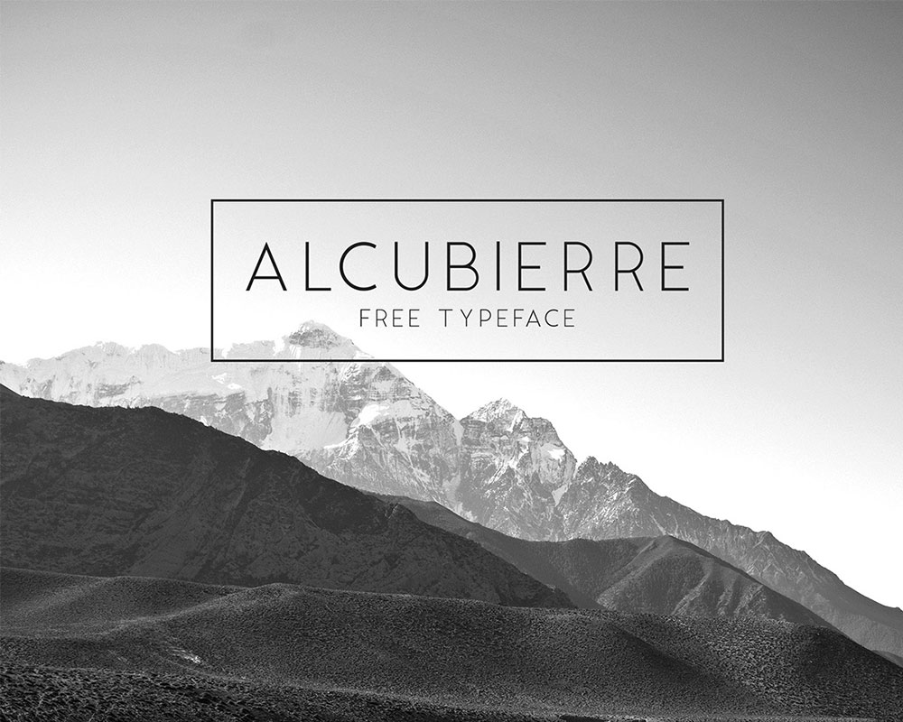
Alcubierre Free Typeface
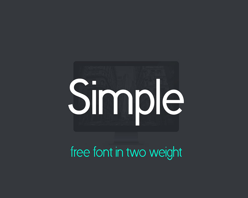
Simple
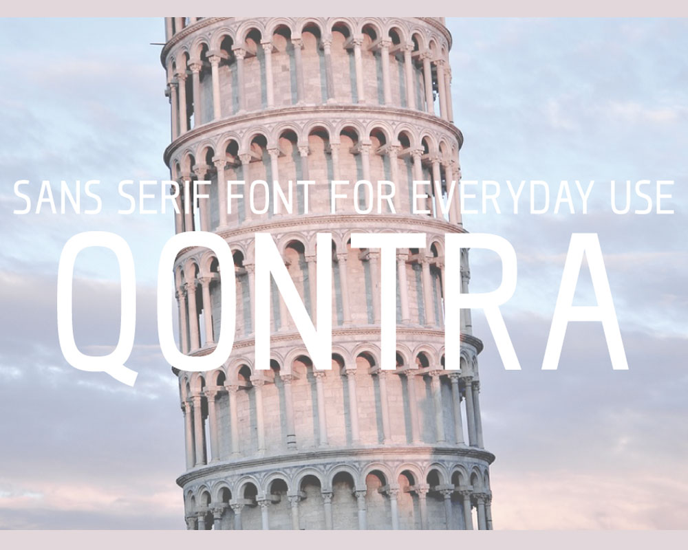
Qontra Sans Serif Font
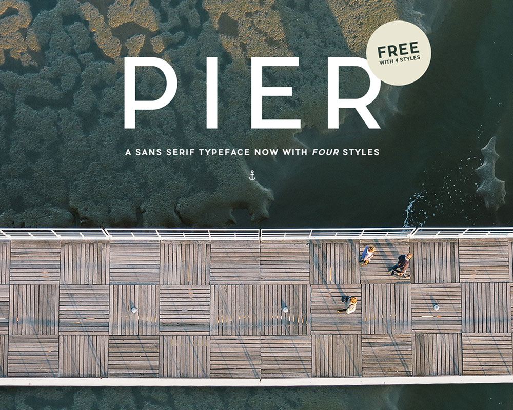
Pier Sans
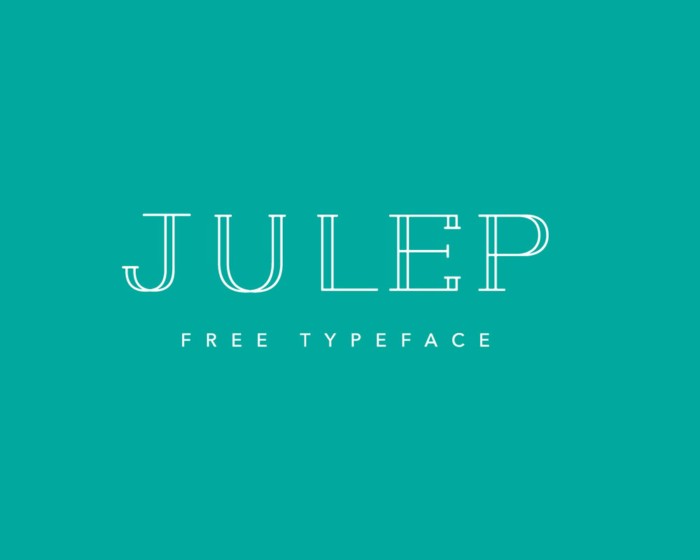
Julep Typeface
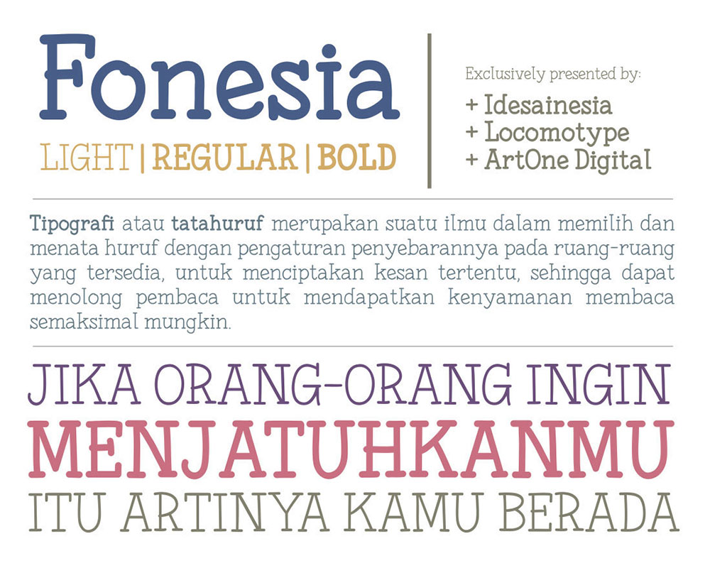
Fonesia Free Font
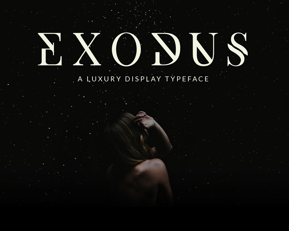
Exodus
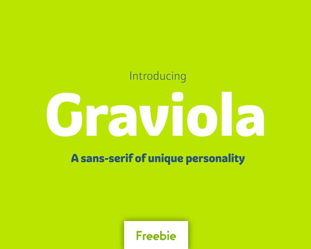
Graviola Regular
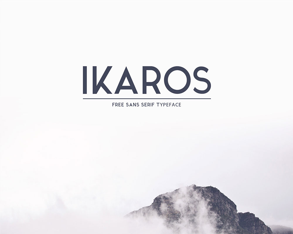
Ikaros Free Typeface
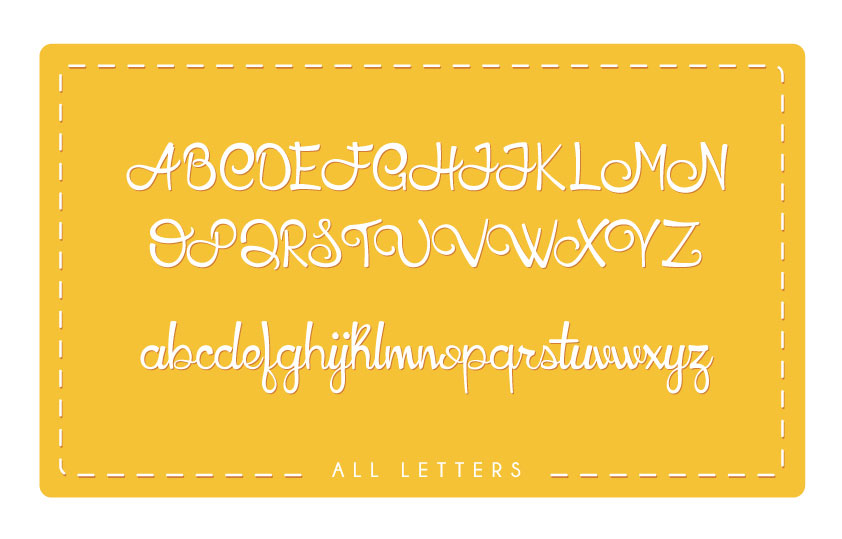
HoneyLlama
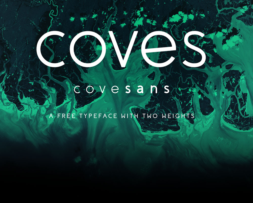
Coves
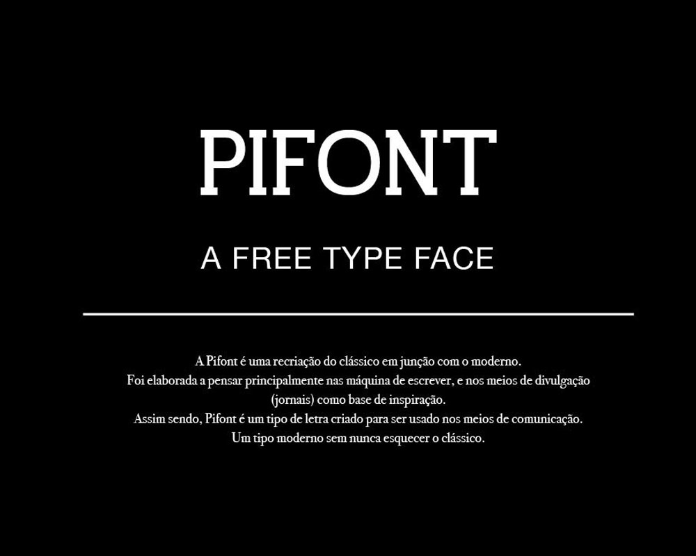
Pifont
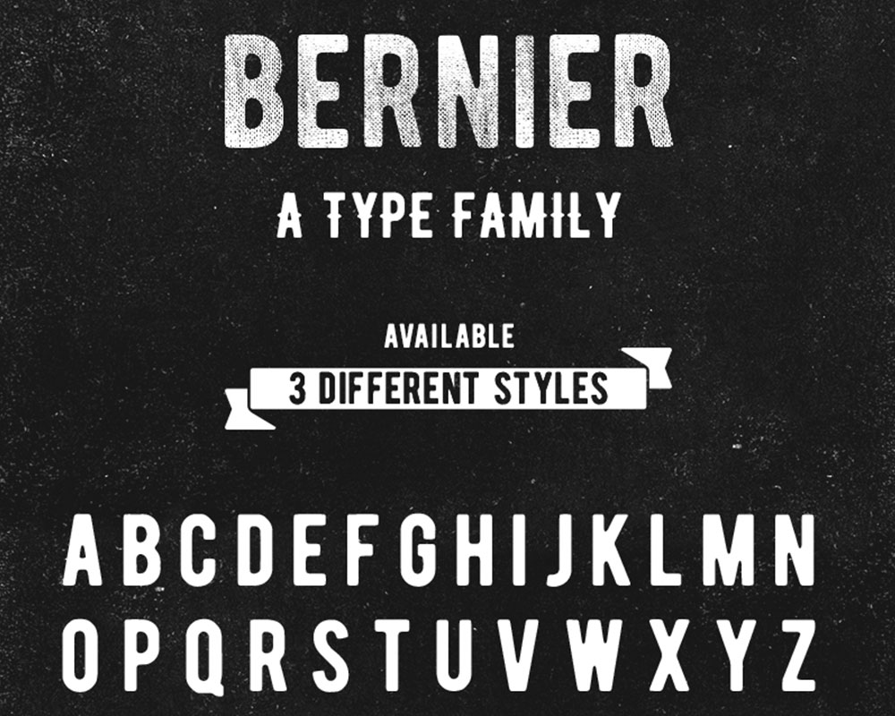
BERNIER™ Free Typefamily
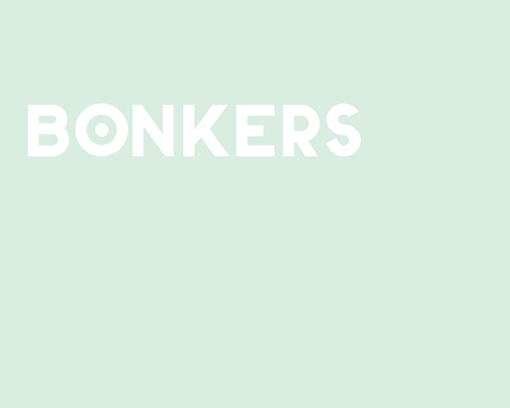
Bonkers
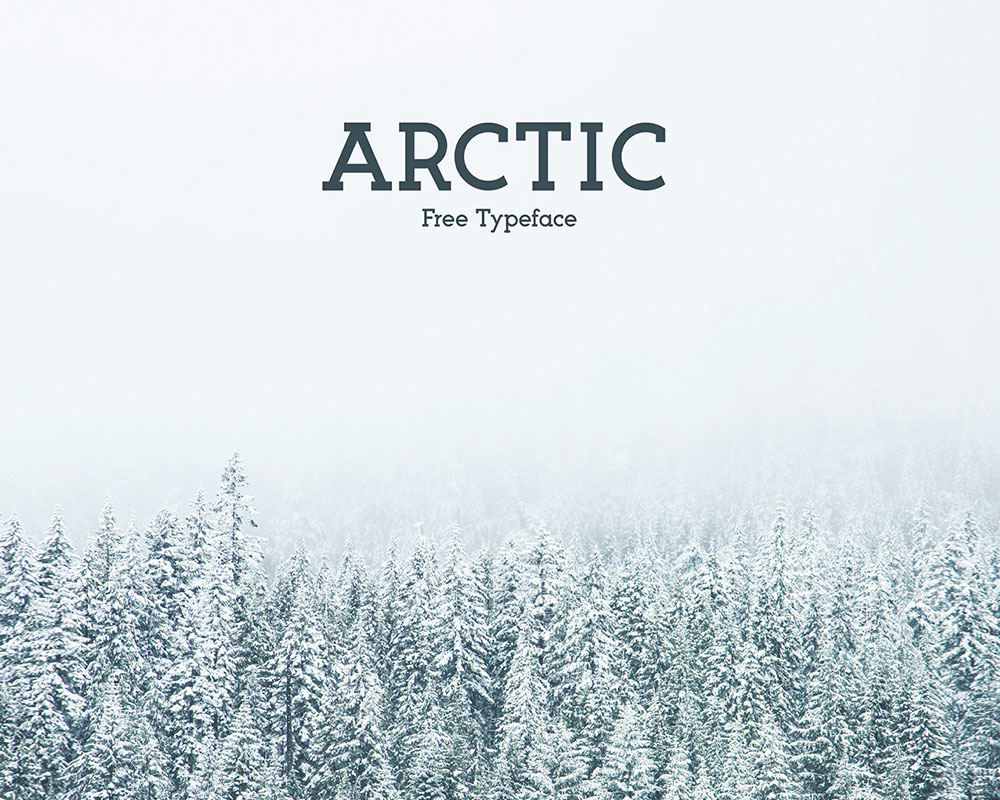
Arctic Free Typeface
NEW INDUSTRY Free Font
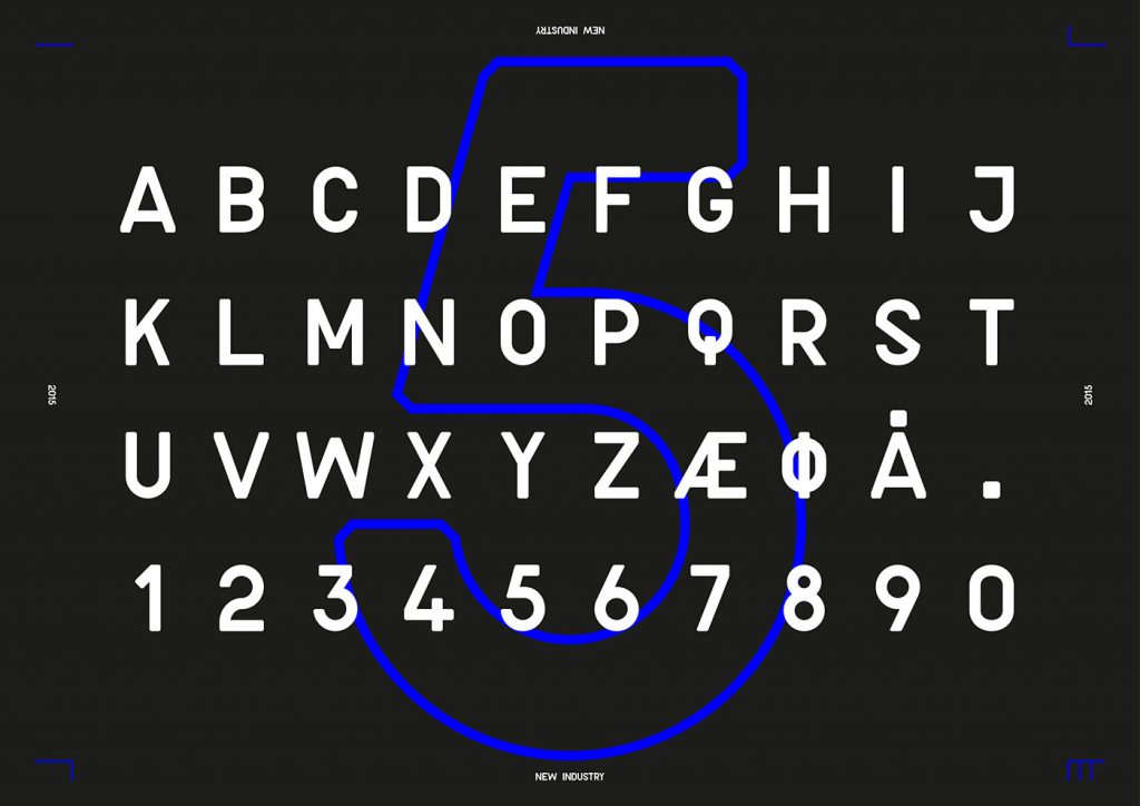
Types of fonts
The number of fonts is just enormous, and some of them are quite difficult to categorize. In fact, classification of typefaces is almost an impossible task, which is something every designer or design historian would confirm, and that’s all because of the difference in fonts’ technical definition. There are certain groups you’ll come across here and there (Old Style, Humanist, BlackLetter, etc.), which are familiar to everybody and will thereof not be discussed in this article. Instead, we’re going to look at four basic groups that are most different from each other, in order to learn something about their features, and how we could make a final decision for our project.
1) Serif: These fonts are, popularly speaking, the most minimal ones. They have the least ‘feet’ or end lines attached to their letters, and are therefore more serious and official. The group itself is among the oldest and most traditional typefaces.
2) Sans-Serif: Sans-serif’s original meaning is ‘without serif’, due the fact that here letters are even more simplified, and they don’t have any lines at the ends. These fonts are considered to be streamlined and modern.
There is an ongoing debate on it, but it is commonly believed that serif fonts are good for large passages because navigating them is easy, and the eyes don’t have a problem moving down the text. The problem, however, is that serifs are small and thin, which often results in an unpleasant pixel-based screen reading experience. The text that is supposed to look clean and crisp turns out to be too noisy and distorting for the eye.
3) Script: Scripts is the general name of cursive, handwritten-like fonts. Their letters are usually connected with each other, and the styles vary from casual and hand-drawn to elegant and sophisticated.
4) Decorative / Display: As the name indicates, decorative fonts are supposed to be real eye-candies that attract attention. Rather than practical, they are unique and unusual, and are therefore convenient for short and specific paragraphs than long texts.
Tips on choosing the proper font
The on-going internet expansion imposed the need for designers to skip using traditional and ‘web safe’ fonts, and enabled them to release their creativity and to choose whatever font they like from the wide spectrum.
At first, the expansion of font creation was considered harmful because typefaces start resembling each others, and some of them were even replaced by different images causing both technical and reading problems on the web browser. Luckily, there are plenty of typefaces nowadays to help you make the best choice for your web project.
The number of hosting services is increasing ever since 2010, while the ‘open font’ format reinforced with @font-face options is becoming the favorite feature for major web browsers.
Headline fonts
Headline fonts are the most impacting ones, which is why designers pay special attention to them and test them by putting them in this specific, most attractive area. It is exactly the headline where you can estimate how a font really looks, because it stands on its own.
Headlines and logos are among the most important parts of website design project because they provide a lot of room for creative experiments, but also because they include lot of essentially unchangeable elements, such as layouts.
Still, once you’ve decided to style your headlines, quotes, and navigation features, your work is about to include additional assets to think of: accessibility, search optimization, and many similar ones.
Body-text fonts
The first thing to remember here is that the choice of available fonts for large text paragraphs is very limited. Inside the ocean of potential choices, you have less than 100 suitable fonts for long reading. In fact, experienced web designers work with no more than 6 fonts for instances such as these.
Another important factor that you have to consider are the reading habits of your audience. At the same time, you need to be aware of their uptake and technical knowledge, but not to deviate that much from your own objectives, and the techniques you’re using to engage visitors to keep reading.
So, how to choose the best font?
Take a look at these useful tips that can help you make a successful decision:
Stay selective no matter what. Be suspicious even concerning fonts you really like, and test them on all parts of your content to ensure that they are web-ready.
Let instinct guide you. This is an important tip for your preliminary choice. If a font caught your eye as the eye of an experienced designer, it is very likely that it will catch your readers’ eye too. Try to combine all other elements and specifications with the fonts you’ve chosen, otherwise the site may see a bit disconnected.
There is no need to rush. Discovering a quality font and typesetting will require plenty of time and patience, but it will be totally worth it.
Consider the size of the file. Certain fonts can support more than 200 languages, meaning that you can use them for larger files.
Stay on alert for browser updates, and try to stay on top of them. Some of them can display substitutions such as small caps, uncommon numerals, and ligatures, and you have to consider all of them in order to choose a font that will be appropriately displayed.
Choose medium sized fonts. Keep in mind that your textual content will be displayed on screens with different sizes, and medium ones are the best proportioned ones to fit on each of them. The best way to transform your font is to impose a bigger x-height, so that even the tiniest details would render well on every screen.





1 thought on “34 Cool And Free Fonts For Designers”
exzellent