
User-centric design. It’s a term that whirls around the dynamic corridors of ecommerce. Yet, few truly grasp its essence. In the bustling realm of online shopping, every pixel of design is the handshake of a brand with its potential client. But why is this handshake so vital? Because an ecommerce platform is more than just a digital store — it’s an experience. A user-centric design ensures that this experience is not only engaging but also intuitive. Over the next paragraphs, we’ll embark on a meticulous journey, delineating the core principles and tactics that shape user-centric designs in ecommerce. With a decade of witnessing the ever-changing facades of online platforms, I’ll provide you with insights carved from facts and proven methodologies.
The Importance of First Impressions
Imagine, for a moment, walking through a bustling city street. Amid the cacophony, a gleaming storefront catches your eye, beckoning you closer. That allure, that magnetic pull, is the first impression. In the online realm, ecommerce interfaces are the modern “storefronts.” Craft them well, and they’re magnetic; falter, and they’re a passing blur. It’s staggering how a mere few seconds can dictate a user’s entire engagement trajectory. Ever heard of “above the fold”? An age-old newspaper term, yes, but its significance has seamlessly transitioned into the digital age. The portion of your website visible without scrolling? That’s your golden real estate. Ensuring its brilliance is pivotal, especially when every split second counts in capturing user attention.
Core Principles of User-Centric Design
Dive deeper into the design world, and patterns begin to emerge. Patterns that aren’t mere coincidences, but are rather the bedrock of effective ecommerce platforms. Let’s unravel them:
Simplicity
Ah, the art of simplicity. Amidst the digital clamor, there’s a sheer elegance in a design that’s both clean and straightforward. Users, inundated with choices, often seek clarity. And that clarity? It often springs from design simplicity, guiding users without overwhelming them.
Consistency
Imagine a symphony. Each note, consistent with the preceding and the following, creates a harmonious tune. Similarly, in design, a unified language fosters familiarity. It’s like walking through different rooms of a house, yet feeling an underlying sense of belonging.
Accessibility
A principle that’s not just about ethics but also broadening horizons. An ecommerce platform should be a welcoming space for all. Including those with disabilities. By ensuring usability for everyone, we don’t just do what’s right; we also expand our audience base.
Feedback Loops
A decade in this niche taught me this: Evolution is key. But how to evolve? Listen. User feedback is a treasure trove of insights. It’s the compass that can guide continuous design refinement, ensuring the platform resonates with its users’ evolving needs.
The Five-Second Rule
Perchance you’ve stood in a bustling art gallery, your eyes skimming over a myriad of paintings. Some works demand mere seconds of attention, while others captivate your gaze, immersing you in their narrative. In the grand gallery of the internet, the “five-second rule” dictates this attention span. But what is it?
Definition and Application
In the vast expanse of the web, a user typically grants a website a meager five seconds to prove its worth. Ecommerce platforms, jostling for attention, must craft a narrative compelling enough to anchor users swiftly. It’s the litmus test of first impressions.
Strategies and Tactics
How does one win this rapid-fire challenge? By merging aesthetics with function. Powerful visuals, synchronized with crisp content and crystal-clear CTAs (Calls to Action), weave the magic. A punchy headline, an engaging visual, and a promise of value — these are your knights in shining armor in this five-second joust.
Tactical Implementation
Ah, so we’ve dissected the theory, the principles that form the spine of user-centric design. But theories are like recipes – unless you gather the ingredients and follow the steps, the dish remains uncooked. Let’s roll up our sleeves and delve into the practical world:
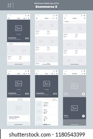
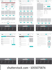
- Wireframing and Prototyping: Begin with a blueprint. Whether you’re sketching out low-fidelity wireframes, just to get a feel, or investing in high-fidelity prototypes to get a detailed preview, this step is paramount. It’s like viewing the skeletal structure of your ecommerce platform before adding the flesh.
- A/B Testing: The digital realm is a land of choices, and sometimes, it’s tough to decide which element resonates better. Is it the blue CTA button or the green? A/B testing is your savior here, leveraging empirical data to refine those design choices, ensuring the best user experience.
- Mobile Optimization: The world, quite literally, lies in our pockets now. With a significant chunk of users accessing platforms via mobile, ensuring a seamless mobile experience isn’t just recommended; it’s imperative. Crafting responsive designs ensures that your platform looks and feels perfect, irrespective of the screen size.
- Professional Touch: Sometimes, the labyrinth of design can be daunting. If you find yourself lost in the maze, remember: experts in ecommerce web design services are just a call away. They come armed with experience and expertise to light up your platform, ensuring it’s both user-centric and conversion-friendly.
Common Pitfalls and How to Avoid Them
Ecommerce design, while brimming with potential, is riddled with pitfalls. Envision a ship navigating treacherous waters; one wrong turn can lead it astray. One of the most prevalent missteps? Overloading platforms with excessive information, turning a potentially enlightening experience into a chaotic maze. But the pitfalls don’t end there. In our relentless pursuit to dazzle, we sometimes neglect mobile users, sidelining the importance of mobile-first design. And, perhaps most tragically, ignoring user feedback. Becoming disconnected from the very audience we aim to serve can leave our platform stagnant. Evading these pitfalls requires vigilance, frequent recalibration, and an unwavering commitment to the user’s needs.
Conclusion
In the vast cosmos of ecommerce, user-centric design emerges as the North Star, guiding platforms to success. It’s not just about aesthetics or functionality alone; it’s about harmonizing the two, crafting an experience that resonates. As we’ve journeyed through the principles, tactics, and common pitfalls, one truth stands clear: a focus on the user isn’t merely an ethical stance; it’s commercially astute. In the ever-evolving landscape of ecommerce, adaptability is key. But, as the sands of design trends shift, let’s not forget the bedrock on which we build: the user. Here’s to creating not just websites, but experiences. To the future of user-centric ecommerce design!