Thanks to the continuously expanding global market it would appear that, as a web designer, you have the wind at your back with respect to getting your share of quality assignments. That would certainly be the case if it were not for the fact that potential clients are becoming more and more sophisticated and demanding in their expectations.
Consequently, you either have to work harder or work smarter to enable your business to grow. Working smarter is the better route when you pick the right tools. Take full advantage of your creative talents. Follow a few simple tips designed to help you deliver websites that your clients will absolutely love.
Having a tool like Be Theme to work with can help you keep a step ahead of the competition. It is the largest and most versatile WordPress theme of them all. This has the features and tools you’ll want to be able to put your creative talents on full display.
As far as tips are concerned – read on.
5 Simple Tips for Building Engaging Creative Websites
Tip # 1: Using too much “white” space? Not likely
For some sites, a headline or logo and a button may be all you need on the home page. The rest of the page can be white space. It depends on how much information is needed to convey to attract a visitor’s interest.
White space helps achieve a minimalist effect. It can be used to draw attention to important design elements or content, or it can simply make any page more attractive. The fact is, it’s actually rather difficult to overuse white space when “more is better” often applies.
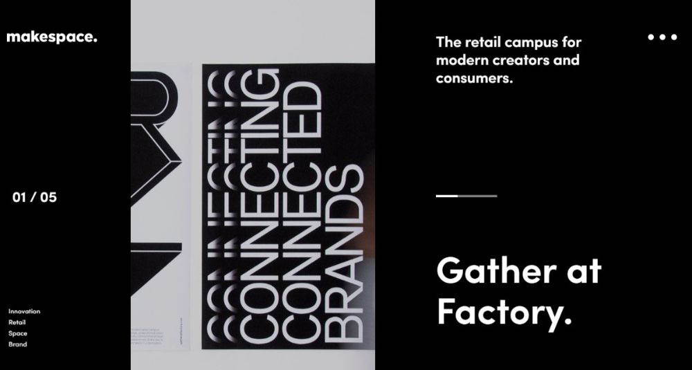
Makespace’s clean design helps the eye to focus on the key message and supporting messages.
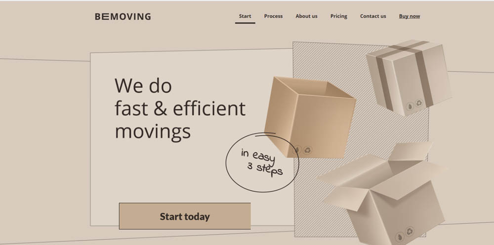
BeMoving 3 illustrates that a seemingly excessive amount of white space actually isn’t and can, in fact, have a significant impact. The Drive New York also uses a generous amount of white (and white space) to great effect.
illustrates that a seemingly excessive amount of white space actually isn’t and can, in fact, have a significant impact. The Drive New York also uses a generous amount of white (and white space) to great effect.

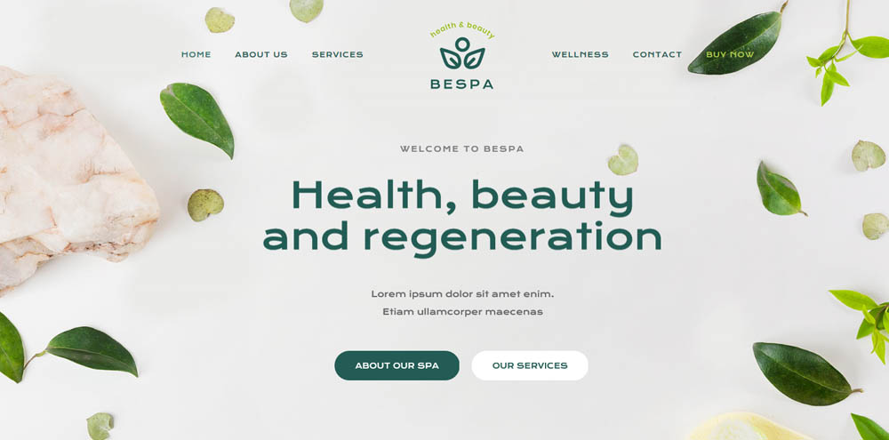
When white space is actually part of the brand, it can really help drive your message home. BeSpa 4 illustrates how plenty of white space can produce a pronounced effect.
Tip # 2: Show visitors how your creativity benefits them
Attempting to show your client how creative you are can be a mistake. A site’s visitors might appreciate the results of your creativity, but their real interest is finding what’s in it for them. In other words, it isn’t about you. Your creativity will be most effective when it helps visitors see themselves as actually using your client’s product or service.
BeLab 2’s homepage video cleverly illustrates how people could use your products to their benefit.

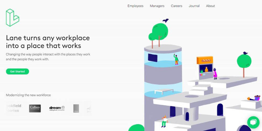
Lane’s approach to expressing structural design perspectives could make any visitor to their site think seriously about taking advantage of the service they offer.
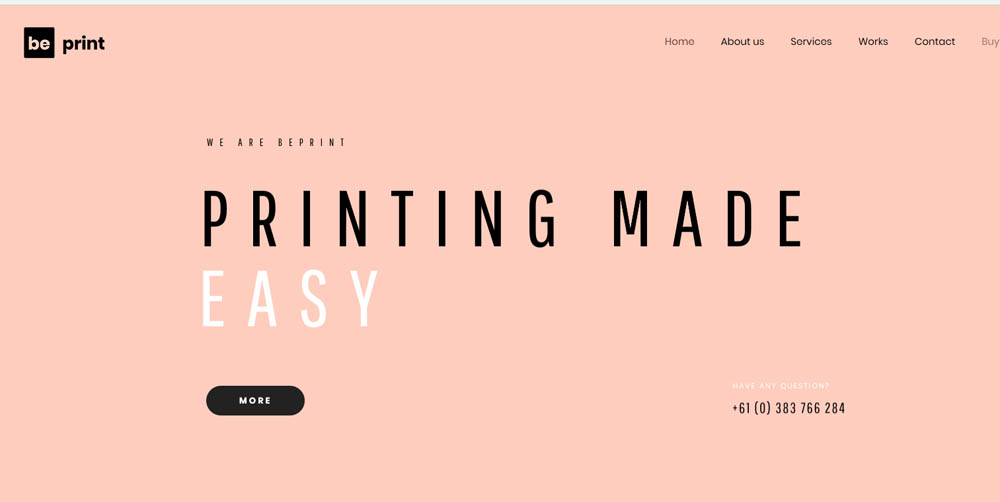
In this BePrint 2 example it’s not the text that’s most effective; rather, it’s the typography and the way in which the text is presented.
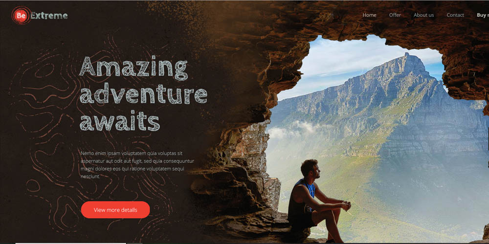
BeExtreme 2 provides an excellent foundation for a travel site or a travel-oriented blog. It’s definitely a source of inspiration to designers and viewers alike.
Tip # 3: Display crystal-clear photos and images
Crystal clear photos and images carry important messages: (1) they contribute to the site’s overall message (2) they can be memorable, and (3), they suggest that the professional care and craftsmanship observed in the website is an indication of how the business is run.
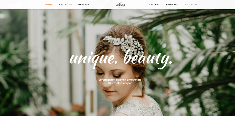
BeWedding Dresses provides an excellent example of how to display crystal clear images with flair.
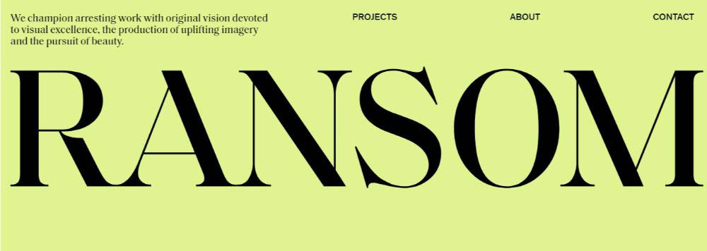
RansomLTD on the other hand, takes a crisp and minimalist tack.
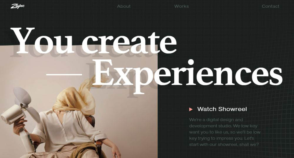
The Zajno creative website shows how crystal-clear pics can be used to showcase your creativity in a way that sends the right message to the visitor.
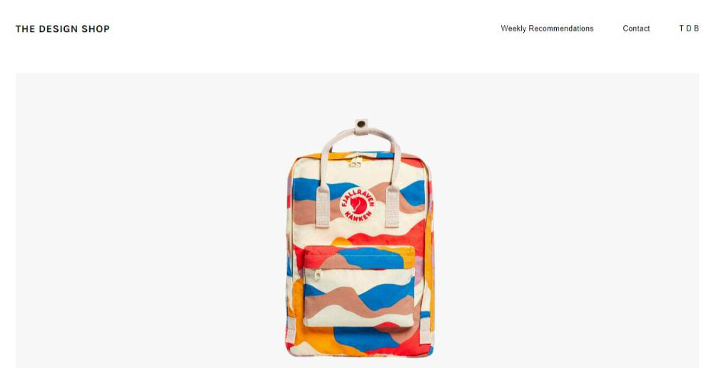
The Design Shop cleverly uses crisp and compelling images together with plenty of white space to showcase their products.
Tip # 4: Select a spellbinding color palette
While all 5 tips are more or less equal in importance the color palette you select can make the difference between success and failure. Following these three simple rules will keep you out of trouble.
- Choose colors that will attract instant attention
- Your palette should visually support the message your site or app is intended to convey
- Make sure the color selection is on brand.
BeLanguage 3’s bright, bold color touches guarantee instant and total attention

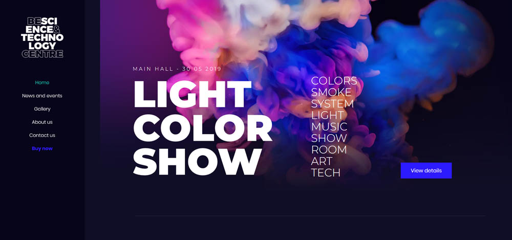
BeScienceCentre has a color scheme that will grab you and won’t let go
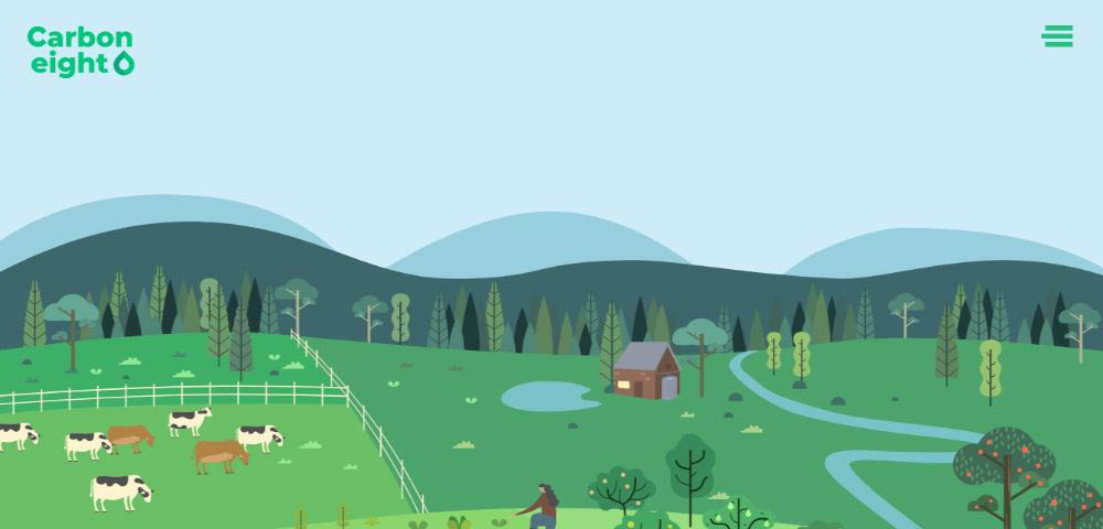
Note how Carbon8 cleverly uses shades of green to align with the site brand. The deep green element takes center stage in the way it directs attention to the center of the page.
BeSupplier uses colors to subtly support the crisp, clear images designed to gain the attention of the types of clients who would be interested in your client’s service.

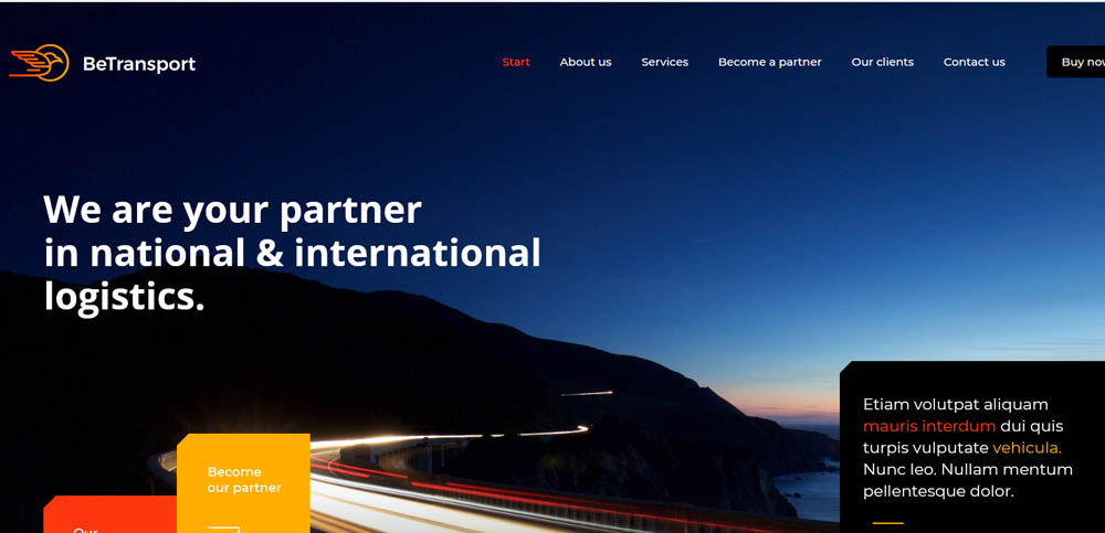
Anyone will find BeTransport 2’s color palette appealing.
Tip # 5: Make your CTAs impossible to ignore
If visitors have to search for a CTA button it can undermine your best creative efforts. Make your CTAs bright and bold or at least easy to spot, and informative.
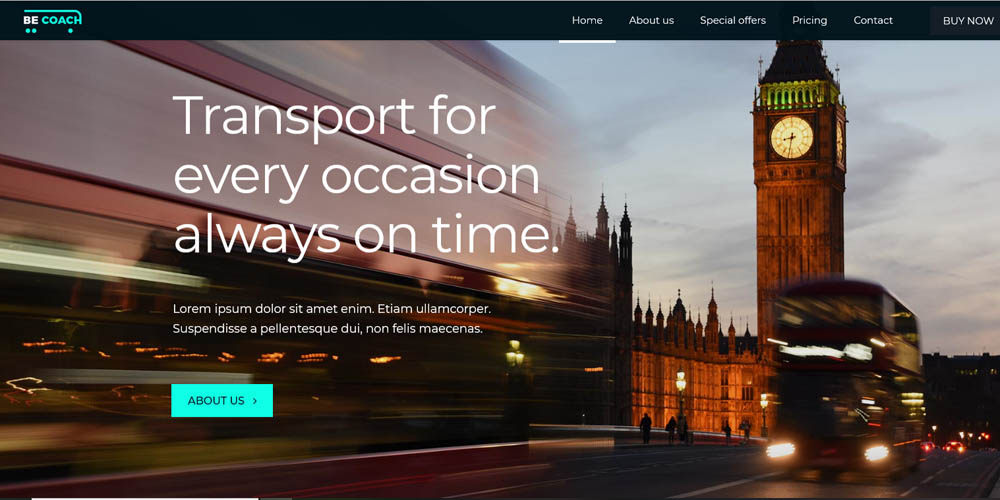
BeCoach’s CTA button is positioned above the fold and also easy to spot. It acts like a gate that encourages visitors to discover what lies beyond.
Stuart illustrates one way to effectively place 3 CTA buttons.

CTA buttons don’t have to be radically different from any of the other elements on a page to attract attention. BeSEO 3 is a helpful example of this.

Building Creative Websites – Summarizing the 5 Helpful Tips
These 5 tips aren’t designed to enhance your creativity. Rather, they serve to help you avoid letting something important fall through the cracks. A home page can be attractive but not relate to the brand or support the message. Poor-quality images can be a turnoff. You know what can happen (or not happen) if your CTA is hard to find or makes the user have to think.
Having quality tools to work with is obviously important too. It’s especially important to use tools that won’t place any limitations on your creativity.
Be Theme, with its gallery of nearly 500 cool pre-built websites, is just such a tool. These pre-built websites are functional, customizable, and feature designs that take into account the 5 tips discussed here. They are designed to perfectly satisfy your needs.