Think back to your school days and you can’t help but wonder why you’ve never had to put all that much of what you were taught to practical use.
Geometry, with its points, lines, arcs, and angles would seem to be a case in point. The truth is, you can put some of what you learned inyour geometry class to good use to make a website’s content easier to follow and more engaging.
Follow along as we explore several ways you could creatively incorporate geometry into your designs. We’ve put together an assemblage of BeTheme pre-built sites and live websites to illustrate how it can be done.
1. Slice your sections diagonally so visitors will naturally “fall” downwards
When building a website, a natural tendency is to create sections a block at a time and place one on top of another. The horizonal lines create disconnects, which they should, but they can also tend to disrupt the natural flow you seek.
Diagonals create a tendency to continue to move downward on a page. Diagonals can also be used to create a “peekaboo” tease with respect to what lies ahead.
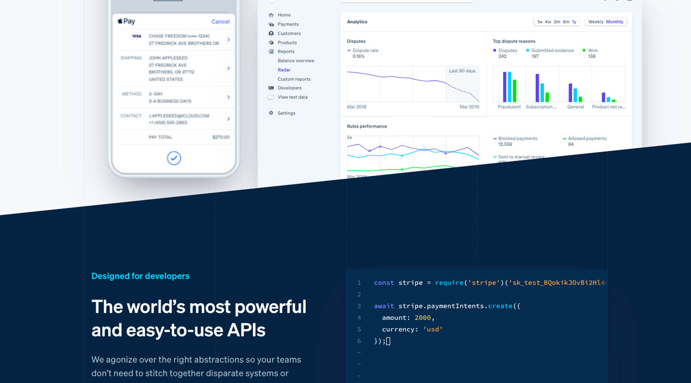
Stripe gives a good example of effectively using a diagonal divider.
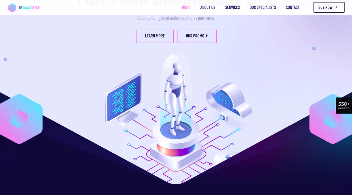
The dividing line gives visitors a peek at what comes next. The information is presented in such a way that a viewer almost can’t help but continue on. You can easily do something similar with BeTheme’s BeData pre-built site.
This pre-built site features several instances where 45-degree angles meet to form a dividing line. Note how a contradictory message could be sent if the 45-degree dividing lines were inverted.
2. Use circles, stars, or other shapes to simplify decision-making
If visitors have to think too much, decision-making fatigue can quickly set in. Confront visitors with too many options or have them have to make too many comparisons can make all but the most dedicated of them head for the exit.
Geometric shapes can be used as recommendations (greatest reviews), as filters (good-better-best), or used to point visitors to:
Plans that offer the best value for the money
Products that are well-liked
Options that have special properties or unique features
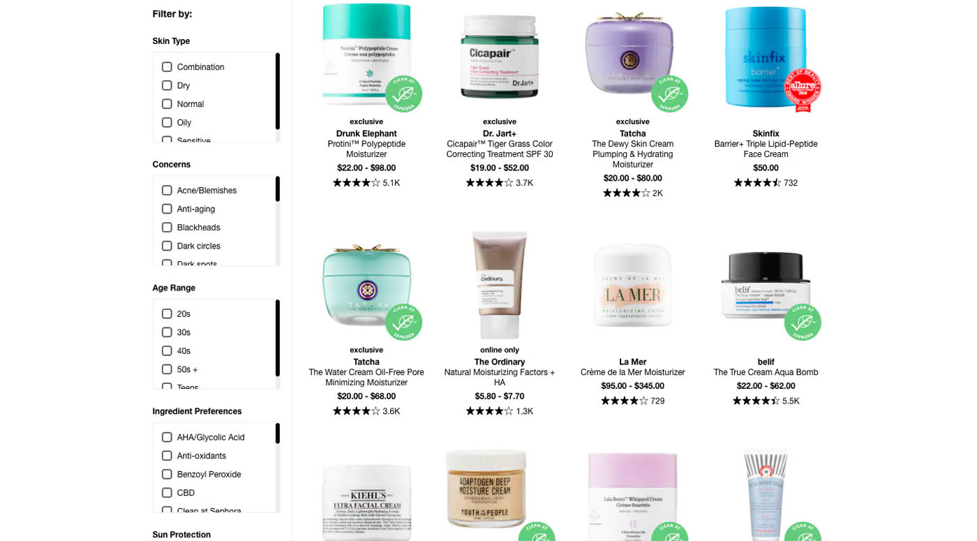
Sephora uses circles to draw attention to popular, premium, or highly-recommended items:
The green circles indicate the products are natural or organic while the red circles represent award winners.
Every shape doesn’t have to have explanatory text.
BeComputerShop uses stars to indicate best-selling items.
The shape used could depend on the product line, but whatever you use will work best if you keep it simple.
3. Use shapes that portray your brand
Consumers seek transparency from the brands they patronize. Words obviously help with this. Images can as well.
Those images could be and often are background images. Those designed to create windows into the brand’s world are also effective. They can be even more so when geometric shapes are used to carve out those windows. Those same geometric shapes can add a personal touch.
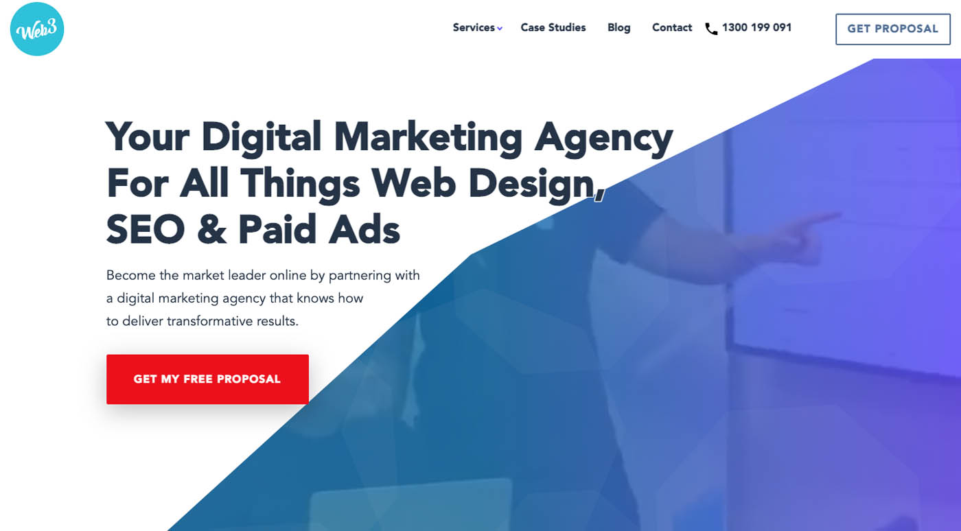
Web3 does it this way:
In this example, a section of the homepage has been carved out in the shape of a polygon containing a brief video about the agency.
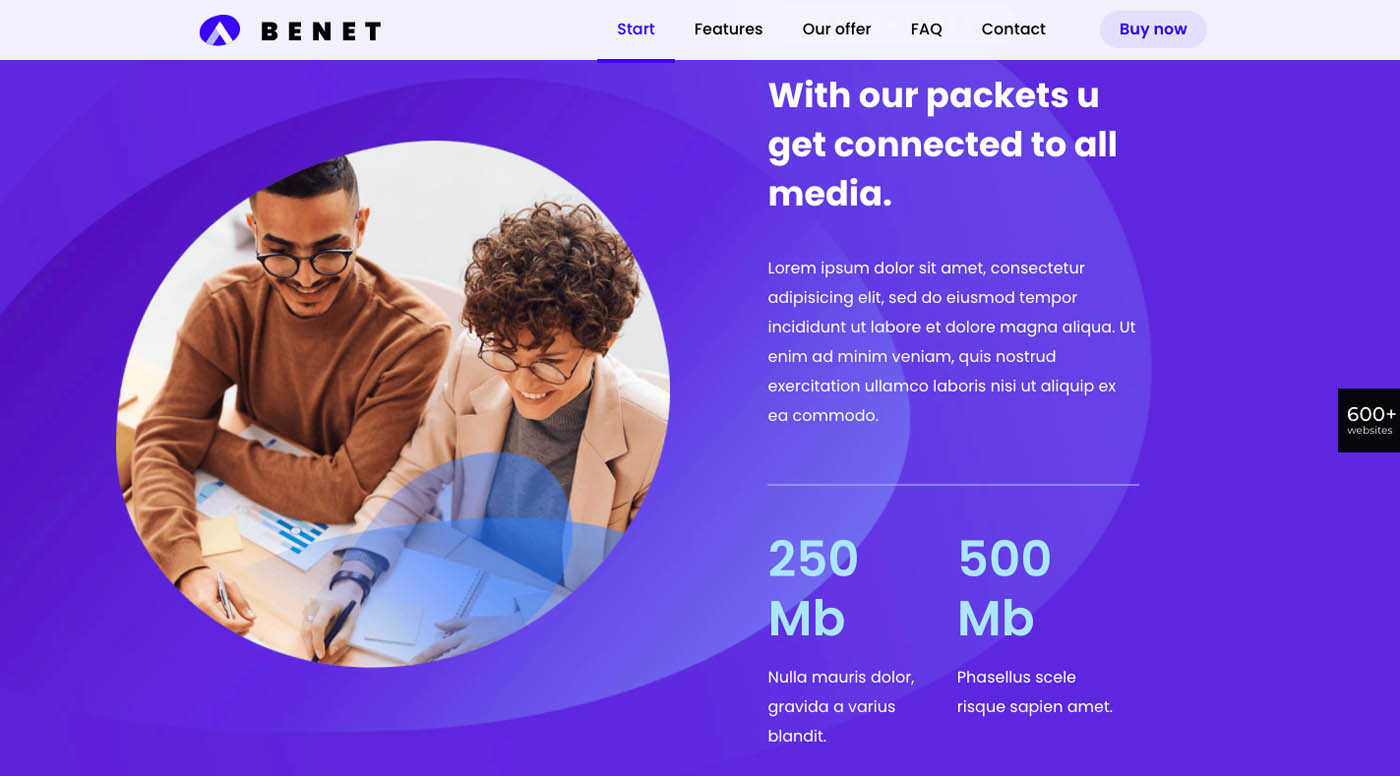
A circular hole is used in place of the polygon, and a static image is used instead of a video. Nevertheless, the effect is similar to that of the Web3 example. The lack of a filter over the image also communicates transparency.
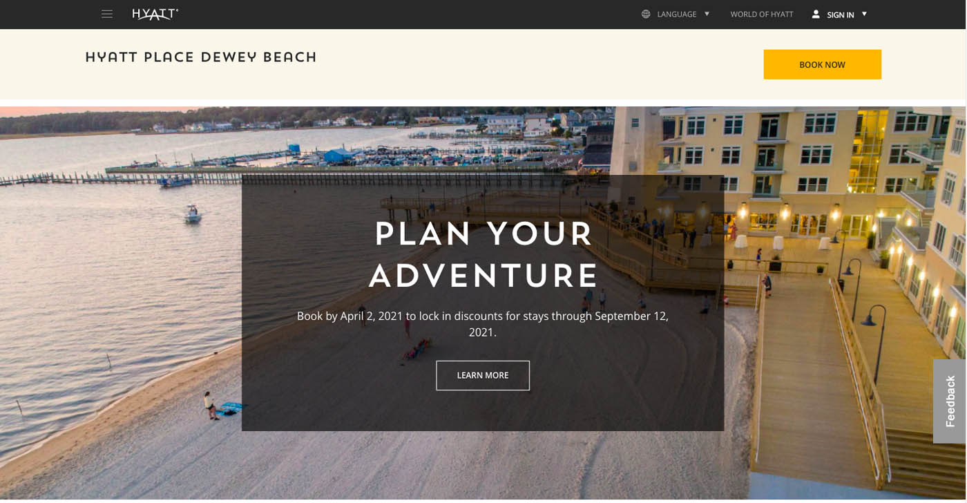
4. Use images that contain geometric figures as a means of directing visitors’ attention
You can select an image that contains its own geometric figure or insert a figure or lines in one the doesn’t. The geometry does not have to be bright and brash. It can subliminally direct a visitor’s attention.
Note how a visitor’s eyes typically focus on the upper left of the screen at first, stop to read the text in the rectangle, move to the right, and follow the boardwalk downwards.
If visitors aren’t immediately drawn to the explainer products and focus on the headline first, the rows in the image will direct them there.
5. Jazz up your content by using different planes
When designing a site to promote a certain activity or event, a flat design may not cut it. A more workable solution would be to place key objects on different planes to give the design a more exciting 3-dimensional feel.
Be careful to note that more isn’t always better. Using planes to focus on one or two elements should suffice while any attempt to make the entire site 3D would be overkill.
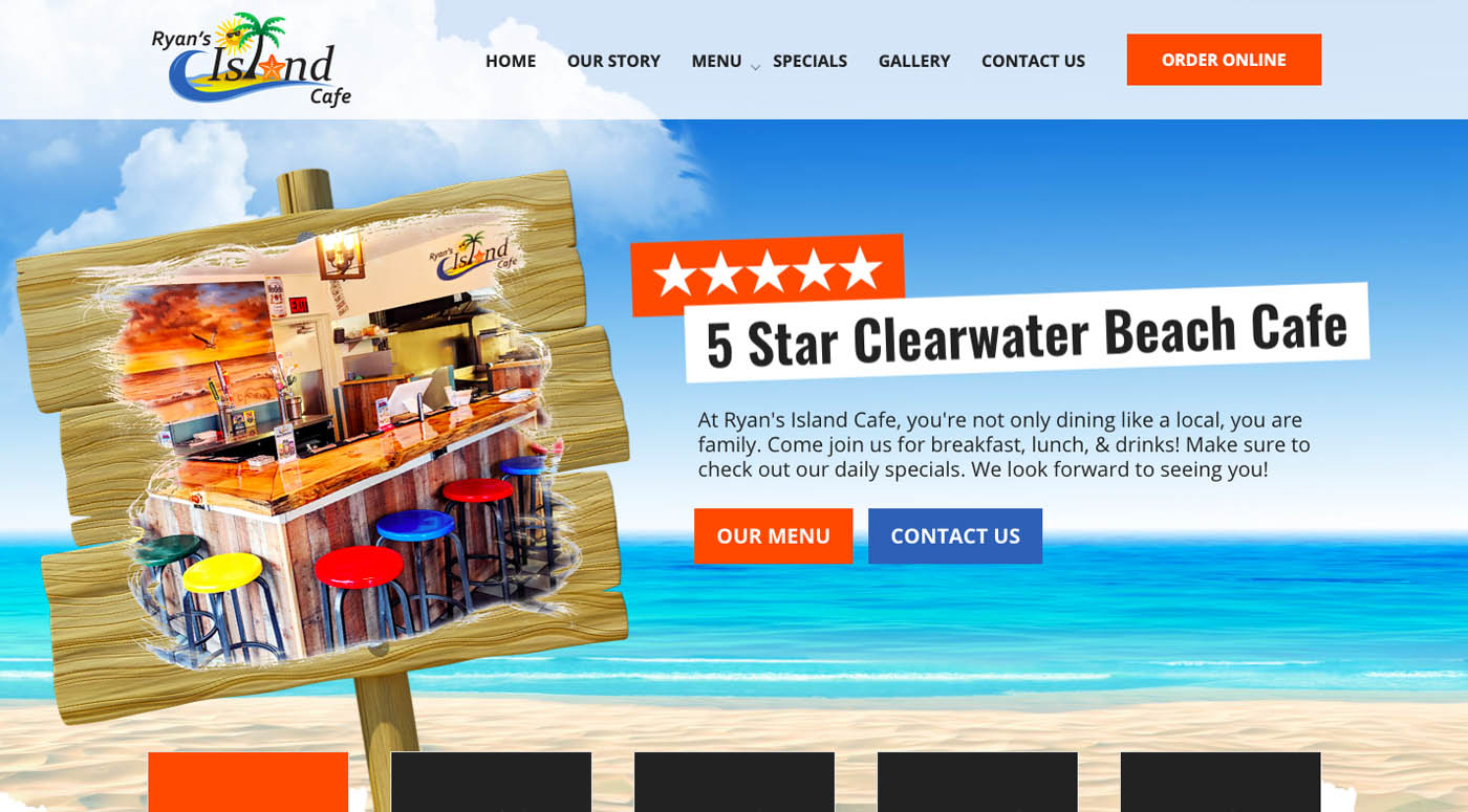
Check out Ryan’s Island Cafe:
This wooden signpost helps to create a day at the beach atmosphere while the juxtaposed image definitely has a 3-dimensional feel.
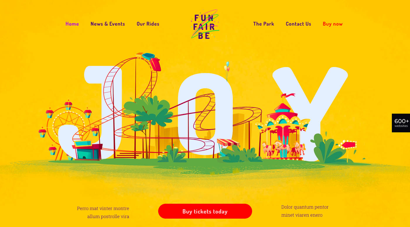
In this case, the way the rides loop through “JOY” creates a 3-dimensional feel.
6. Use lines and arrows created from shapes to point visitors in the right direction.
One way to keep visitors moving down the page or in a desired direction is to use directional lines or arrowheads created from a combination of geographic figures.
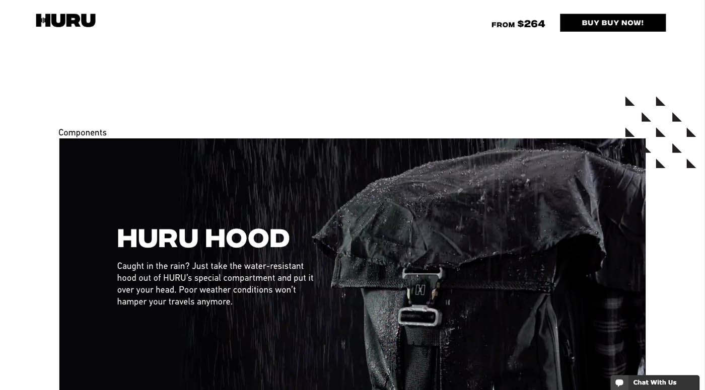
HURU’s product pages are filled with these types of graphics:
In this example, a bunch of triangles form an arrowhead that points to a key backpack feature.
You could also follow BePhotography’s example by using plus signs and circles to create a path.
These directional cues smoothly take visitors from piece to piece.
7. Use the psychology of shapes to motivate action
The psychology of a shape can be used to stir a visitor to take action.
For example
A Square suggests traditionalism and balance
A Circle implies harmony, infinity, and protection
A Triangle can mean stability and energy
A Rhombus suggests contemporariness and excitement
A Hexagon is often used as a symbol of unity and strength
By choose the right shape it can be easier to persuade a site visitor to take the next step.
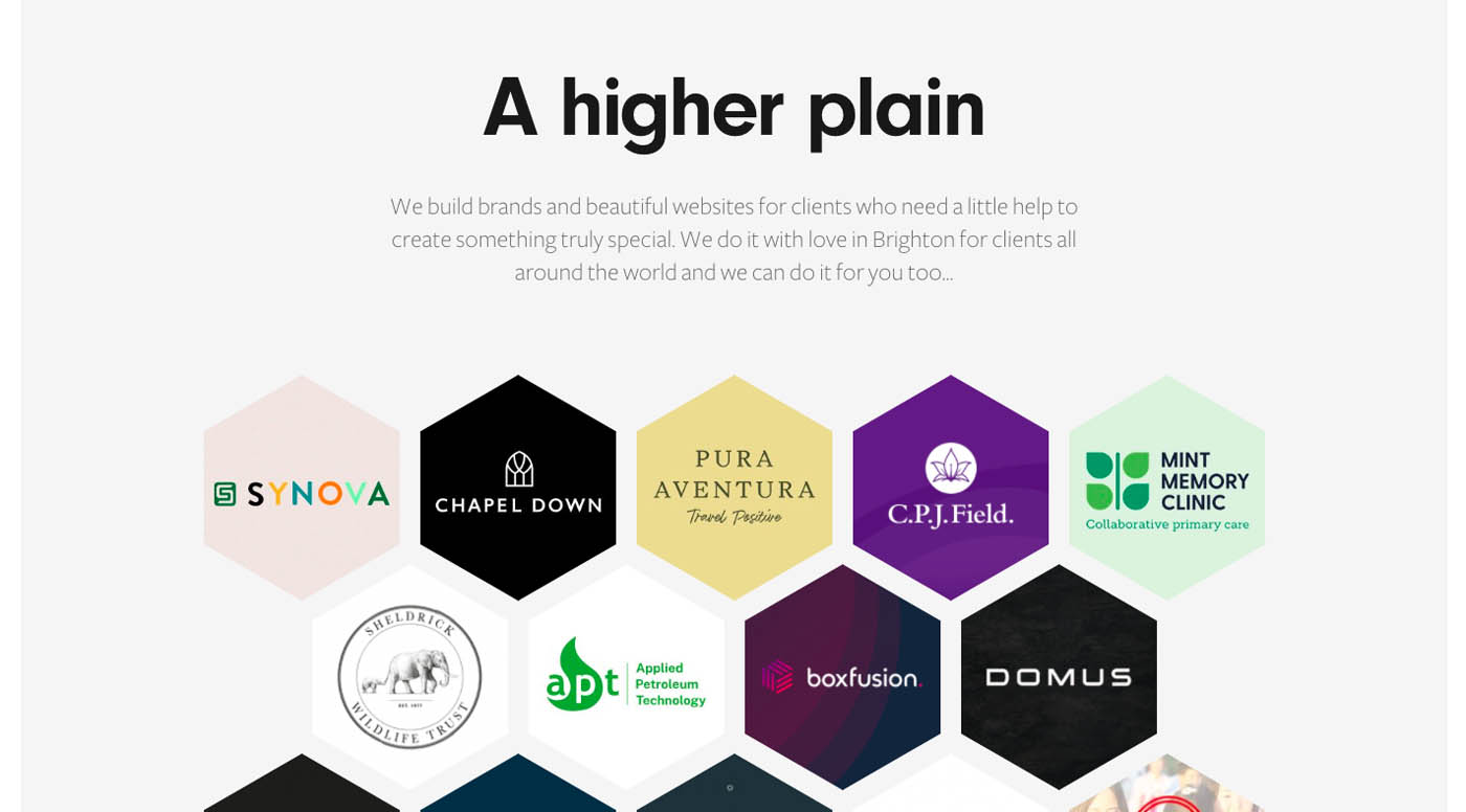
Built by Buffalo uses a beautiful arrangement of hexagons to introduce people to its website.
The message the hexagons send is that the business is trustworthy, reliable, and does excellent work.
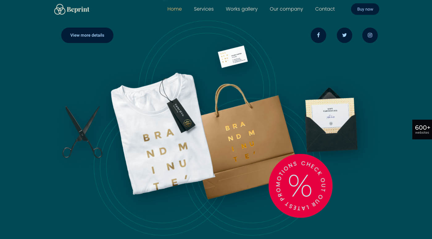
BePrint uses a Venn-like arrangement of circles to convey its message.
The design may be subtle, but it is a good one. It supports the brand by becoming part of the logo, coupled with the psychological undertones of harmony it sends out.
How will you creatively use geometry in web design?
Geometry in web design should never be limited to placing colorful shapes in seas of white space. Figures, lines, and planes can be used to direct visitors through a page or site or used psychologically to engage them and encourage them to take actions. Many of BeTheme’s pre-built sites already have some of these creative uses embedded into their designs. If you would like to take advantage of this trend, BeTheme is as good a place to start as any.